


Every great user interface starts with a solid plan. It's tempting to jump straight into designing slick visuals, but that's a recipe for costly revisions and a final product that just doesn't connect. A truly effective UI is built on a four-part process: strategize first, then wireframe the structure, apply visual design, and finally, test with real users.
This approach ensures the end result isn't just nice to look at, but also intuitive and effective—especially when you're working within a complex enterprise system like Sitecore.
Building Your UI Design Foundation in Sitecore

Before you even think about pixels and color palettes, you need a strategic foundation. Skipping this groundwork is a common mistake that leads to interfaces that miss the mark. This initial phase is all about turning abstract business objectives into a concrete, actionable design brief.
On enterprise platforms like Sitecore, this starts with getting key stakeholders in a room. The goal is to get past vague requests like "make it look modern" and nail down specific, measurable Key Performance Indicators (KPIs).
Translating Business Goals into Design Briefs
The first real step is to sit down and talk with stakeholders from every corner of the business—from marketing and sales to IT. You need to conduct structured interviews to get to the heart of what they really need and how the UI can help them succeed.
Ask sharp, targeted questions. Are we trying to boost lead generation by 15%? Or maybe the goal is to slash support calls by making self-service options clearer? You have to get these metrics on paper. This information becomes the soul of your design brief, a document that gets everyone on the same page about the project’s goals and limitations.
A rock-solid design brief should clearly lay out:
- Project Goals: What specific, measurable outcomes are we aiming for? (e.g., increase user engagement on key content pages by 20%).
- Target Audience: Who are we actually designing for? What’s their technical comfort level, what motivates them, and what are their biggest frustrations?
- Technical Constraints: What are the platform's limitations? For example, how will the design fit into the component-based architecture of Sitecore SXA?
- Success Metrics: How will we know if we've won? This ties directly back to those KPIs we defined earlier.
Getting this alignment upfront is your best defense against scope creep. Later, when a stakeholder suggests a new feature, you can point back to the brief and ask, "How does this feature help us hit our primary goal of increasing conversion rates?" To really nail this, it's essential to understand the best practices for user interface design.
Defining User Personas for Enterprise Audiences
Once the business goals are locked in, it’s time to shift your focus to the end-user. Creating detailed user personas is an incredibly powerful way to keep your design user-centric. These aren’t just generic descriptions; they are research-backed archetypes representing your key user segments.
For a B2B website powered by Sitecore, for instance, you might create personas like "Maria the Procurement Manager" or "David the Technical Researcher." Each persona should detail their goals, frustrations, and the typical path they take on your site. Understanding your Sitecore digital experience platform is a huge part of building effective personas.
A user interface is like a joke. If you have to explain it, it’s not that good. This principle really drives home the importance of intuitive design, where the user's path is obvious without needing a manual.
This focus on the user isn't new. One of the biggest leaps in UI design history happened at Xerox PARC back in the 1970s. That’s where engineers developed the very first graphical user interface (GUI) with icons, windows, and a mouse. This shift away from intimidating command-line interfaces made computers accessible to everyone, paving the way for the user-centered design we know today.
Ultimately, all this foundational work makes sure your interface is more than just a pretty face. It becomes a strategic tool, engineered to drive specific, measurable business results within the Sitecore ecosystem.
Mapping the User Journey with Wireframes

Once your strategy is locked in, it's time to translate those ideas into a structural blueprint. This is where you map out the user’s path from start to finish and build the skeleton of your interface using information architecture (IA) and wireframing.
Frankly, this is the step that keeps a beautiful design from becoming an unusable mess. It’s about building a solid foundation before you even think about picking out colors or fonts.
When you're working with big enterprise systems like Sitecore and SharePoint, you're juggling huge amounts of content and often complex user permissions. Just slapping pages together won't cut it. You need a logical system that guides users to their goals without a second thought, whether that's a customer on a Sitecore e-commerce site or an employee digging through a SharePoint document library.
Structuring Information for Sitecore and SharePoint
Information architecture is really just the art of organizing content so people can find what they need. For a platform like Sitecore, this usually means designing a navigation structure and content hierarchy that mirrors marketing funnels and customer pathways. If you want to get this right, you have to start with a deep dive into your users, which is covered well in this guide on understanding user journey mapping.
Switch gears to a SharePoint intranet, and the IA focus shifts entirely. Now, it's all about task completion and knowledge discovery. Success is measured by how quickly an employee can track down a specific company policy or find the right project document. The IA here needs to support powerful search capabilities and intuitive document library structures.
No matter the platform, a solid IA delivers on a few key promises:
- Intuitive Navigation: Users should be able to predict where to find information. No guesswork needed.
- Scalability: The structure needs to accommodate growth. You can't rebuild the foundation every time you add new content.
- Clarity: It reduces cognitive load. Users shouldn't feel overwhelmed by endless choices.
I see this all the time: companies design their IA from their own perspective, using internal jargon and department names. Don't do it. Always build your structure around how the end-user thinks and the language they actually use.
Creating Low-Fidelity Wireframes
Think of wireframes as the simple, skeletal outlines of your user interface. They are intentionally stripped down, focusing purely on layout, content placement, and user flow—not colors, fonts, or fancy graphics. This low-fidelity approach is key because it lets you iterate and get feedback quickly without getting bogged down in visual details.
It's like drawing the floor plan for a house before you decide on the paint colors. You’re figuring out where the rooms (pages), hallways (navigation), and major appliances (key interactive elements) go.
For a Sitecore project, your wireframes would map out essential page templates—like the homepage, product detail pages, or the entire checkout flow. You'd be asking questions like: Where does the main call-to-action belong? How should we display related products? To really visualize these pathways, our customer journey mapping template can help you build out these specific scenarios.
On a SharePoint solution, a wireframe might show the dashboard for a project management site, laying out where task lists, document previews, and team calendars will live. The goal is always to validate that the layout supports the main tasks people need to get done.
Validating Concepts Early
Here’s where wireframing really shines: it validates your core concepts with stakeholders and test users incredibly early in the process. It is far cheaper and faster to redraw a box on a wireframe than it is to recode a fully designed component that's already been built.
By turning these simple wireframes into clickable prototypes, you can put them in front of real people and see where they get stuck.
This early testing uncovers friction points you might have completely missed. Can users find the contact form easily? Is it obvious what that button does? Answering these questions now ensures your foundational structure is sound. Wireframing bridges that crucial gap between strategy and visual design, confirming that your UI is not only logical but built from the ground up for a smooth user experience.
Designing a Cohesive Sitecore Experience
With a solid wireframe in hand, you’re ready to bring the user interface to life. This is the stage where you move past layouts and into crafting a visual identity that not only reflects your brand but also speaks directly to your users. When working with the Sitecore Experience Platform, this is less about decoration and more about building a systematic visual language.
It’s all about applying the fundamentals—color, typography, and spacing—in a way that supports a component-based architecture. Every decision you make should contribute to a cohesive experience that feels intentional and consistent across every interaction.
Leveraging Sitecore SXA for a Scalable Design System
The best way to guarantee visual consistency in a large Sitecore implementation is to build a design system. Think of it as your single source of truth for all UI elements. It’s a library of reusable components and clear guidelines that dictates how everything should look and behave.
Sitecore Experience Accelerator (SXA) is built for this exact purpose. It provides a framework of standardized, reusable components—like navigation bars, carousels, and forms—that you can style to match your brand. By using SXA, you stop designing one-off pages and start building a library of flexible components that can be assembled to create new experiences quickly.
This component-based approach offers some major advantages:
- Brand Consistency: Every button, link, and form field will look and feel the same across your entire digital property, strengthening brand recognition.
- Development Speed: Developers can pull pre-styled, pre-tested components from the library instead of building them from scratch every time.
- Easier Maintenance: Need to update your branding? Change a component's style in one central place, and the update will apply everywhere it's used.
This methodology prevents the visual chaos that can creep in when different teams are building different parts of a large website. It establishes a unified visual language from the very beginning.
Practical Applications of Visual Principles
To build an effective design system in Sitecore, you have to apply core visual principles thoughtfully to your components. It’s not just about what looks good; it’s about what works to guide the user and create clarity.
Start with your color palette. Define primary colors for key actions (like "submit" buttons), secondary colors for less important elements, and accent colors to draw attention. Similarly, establish a clear typographic hierarchy. Your main headings (H1) should be distinct from subheadings (H2, H3) and body text, creating a scannable, logical flow.
The real goal of visual design in a system like Sitecore is to make the interface feel calm and predictable. By establishing strict rules for spacing, alignment, and color, you reduce the user's cognitive load. They don't have to think about how the interface works; they can just focus on their goal.
This structured approach to visuals became even more critical with the rise of touch screen technology. Before touch screens, interfaces were built around physical keyboards and mice. Touch screens allowed users to interact directly with on-screen objects using gestures like tapping and swiping. This shift pushed designers toward more minimalistic, gesture-driven layouts to support quick interactions—a trend that exploded as smartphone users surpassed 3.2 billion by 2019. You can dive deeper into this design evolution with insights from Calibraint.
By embedding these principles into your Sitecore SXA components, you ensure every element serves a purpose. A well-placed button with strong color contrast isn't just an aesthetic choice; it's a tool for guiding the user toward a conversion. Consistent spacing and alignment aren't just for looks; they create a sense of order that makes complex information easier to digest. This systematic approach turns your visual design from a simple veneer into a functional, hardworking part of the user experience.
Good UI design hinges on established principles that guide user behavior and create intuitive interfaces. When working within Sitecore's component-based architecture, applying these principles systematically ensures every element—from a simple button to a complex data grid—contributes to a cohesive and effective user experience. The table below outlines these core principles and how they translate into practical design choices for Sitecore components.
Key UI Design Principles for Sitecore Components
By building these principles directly into your Sitecore design system and component library, you create a foundation for high-quality, user-centric experiences that can scale effectively across your entire digital presence. This isn't just about good design—it's about creating a functional framework that empowers content authors and developers alike.
Customizing the SharePoint User Interface

While a platform like Sitecore is often aimed at external customer experiences, designing for SharePoint is a whole different ballgame. The focus pivots inward, targeting internal productivity, easy information discovery, and seamless collaboration among employees.
A great SharePoint UI transforms a generic intranet into a branded, engaging digital workspace that people actually want to use. The objective isn't just a facelift; it's about streamlining workflows and putting critical information at your team's fingertips. This means moving beyond the default SharePoint Modern sites to create a space with a strong brand identity, intuitive navigation, and custom elements that solve real business problems.
Applying Your Brand to SharePoint Modern
First things first: brand it. A branded SharePoint site feels less like a generic piece of software and more like a true extension of your company culture. The SharePoint Framework (SPFx) is your best friend here, allowing for deep customization without breaking core functionality or causing headaches with future updates.
Branding goes way beyond just sticking your logo on the top left. It's about building a consistent visual language that guides the user. Key areas to focus on include:
- Custom Themes: Define your primary and accent colors to ensure every web part and site element feels on-brand. This creates a cohesive look across all your communication and team sites.
- Typography: Establish consistent font styles for headings and body text. A clear typographic hierarchy makes dense intranet pages much easier to scan and digest.
- Site Headers and Footers: Use SPFx application customizers to build out branded headers and footers. This gives you consistent global navigation and essential links on every single page.
This level of polish turns a loose collection of pages into a unified digital headquarters, reinforcing your brand internally and making the platform feel more authoritative and trustworthy.
Designing Intuitive Navigation and Structure
Without a clear plan, a SharePoint intranet can quickly spiral into a confusing maze of sites and document libraries. If employees can't find what they need, they'll get frustrated, and adoption rates will plummet.
A classic mistake is organizing SharePoint navigation around departmental silos. Instead, think like an employee. Structure your navigation around common tasks and goals. An employee shouldn't need to know which department owns a policy just to find it.
To build a user-centric navigation experience, implement a hub site architecture. This lets you group related sites together under a single, consolidated navigation umbrella. For instance, you could link all HR-related sites—like benefits, payroll, and onboarding—under a central "HR Hub." This dramatically simplifies the user's mental map of the intranet.
Mega menus are also incredibly effective, especially for larger organizations. They let you display a broad range of links in a structured, multi-level format, giving users a bird's-eye view of the intranet's content without endless clicking.
Building Custom Web Parts and Dashboards
This is where you can unlock the real power of SharePoint UI design. While out-of-the-box web parts are handy, custom SPFx web parts can surface critical information from other business systems, turning your intranet into a true productivity engine.
Imagine a custom dashboard for your sales team. It could pull data directly from your CRM, displaying key metrics like quarterly targets, recent wins, and top-performing products right on the SharePoint homepage. No more switching between apps to find essential info.
Another powerful move is to design genuinely usable document libraries. Don't just dump files into folders. Use metadata columns to create filterable and searchable views that make sense. A marketing team's library could be filtered by campaign, content type, or target audience, making it infinitely easier to find specific assets.
For more in-depth strategies on taking your platform to the next level, you can explore expert guidance on SharePoint solutions designed to drive user adoption.
By combining strong branding, logical navigation, and purposeful custom components, you can elevate your SharePoint intranet from a simple content repository into an indispensable tool for daily work.
Validating Your Designs with Prototypes and Testing
A visually stunning design is nothing more than a well-educated guess until real users get their hands on it. The validation stage is where you swap assumptions for facts, making sure your interface is genuinely functional—not just beautiful—before you commit to the expensive process of development. This all kicks off with building interactive prototypes that breathe life into your static designs.
For complex platforms like Sitecore or SharePoint, a prototype is your first real opportunity to simulate the final product. It lets stakeholders and users click through different flows, play around with components, and get a tangible feel for the interface. We're not talking about code here; it's about creating a high-fidelity illusion that lets you test drive the design.
Building Clickable Prototypes
Modern design tools have made it incredibly simple to transform static wireframes into clickable, interactive mockups. The aim is to create something that feels real enough for users to complete specific tasks, whether that's navigating a product page in Sitecore or trying to find a document in a SharePoint library.
A solid prototype should demonstrate a few key things:
- Key User Flows: Map out the most critical paths. Think of a customer checkout process or an employee trying to submit a timesheet.
- Interactive Elements: Show how buttons, dropdown menus, and forms actually behave when someone clicks or taps them.
- Realistic Content: Use real text and images whenever you can. "Lorem ipsum" just doesn't give users the context they need to offer meaningful feedback.
This prototype then becomes the centerpiece of your usability testing and serves as a common reference point for everyone involved—from developers to stakeholders.
Practical Usability Testing Methods
Once your prototype is ready, it's time for the moment of truth: usability testing. This process is all about watching real people try to complete tasks using your interface. The goal is simple: find the friction points. Where do users get confused, frustrated, or completely stuck?
One of the most powerful methods is the moderated usability test. In this setup, a facilitator guides a user through a series of tasks, asking them to "think aloud" as they navigate the prototype. This gives you a direct window into their thought process, revealing subtle usability issues that quantitative data would completely miss.
Another great approach is task-based analysis, where you measure success rates and completion times. Can 8 out of 10 users add an item to their cart in under 30 seconds? This kind of data gives you concrete proof of what’s working and what’s not.
The most humbling—and valuable—feedback comes from watching someone struggle with an interface you thought was perfect. Testing forces you to check your ego at the door and design for the user, not for yourself.
The infographic below shows the simple but powerful cycle of prototyping, testing, and refining that leads to a much stronger final product.
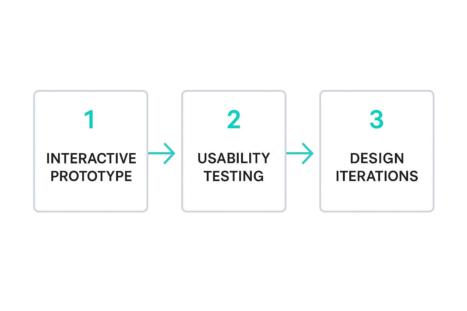
This iterative loop is a great reminder that design isn't a straight line. It's a cycle of continuous improvement driven by what you learn from your users.
Iterating Based on Actionable Feedback
The final—and most important—step is to turn all those test findings into actual design improvements. Raw feedback isn't enough; you need to synthesize it into actionable insights. Start by grouping observations into common themes. For instance, if three different users struggled to find the search bar, that's a crystal-clear signal to rethink its placement or prominence.
Prioritize the fixes based on their impact. A minor tweak that affects every single user is often more critical to address than a major bug that only a tiny fraction of users will ever encounter. This cycle of prototyping, testing, and refining is what separates good interfaces from truly great ones.
For a deeper look at how to evaluate and improve your existing digital products, a comprehensive user experience audit checklist can be an invaluable tool for pinpointing areas that need refinement. By systematically validating your decisions with real user data, you move from designing on instinct to engineering an interface that is proven to be effective, intuitive, and ready for development.
Answering Your Top Questions on Sitecore and SharePoint UI Design
When you're designing for heavy-hitting enterprise platforms, you run into some specific challenges. While the core rules of good UI always apply, platforms like Sitecore and SharePoint have their own quirks. Let's tackle some of the most common questions we hear from teams diving into these projects.
Getting these answers right from the start helps you build interfaces that not only look good but are also smart, strategic, and actually feasible to build and maintain.
What's the Main UI Difference Between a Sitecore Site and a SharePoint Intranet?
The biggest difference boils down to one word: purpose. And that single word drives every design choice you'll make.
A public-facing Sitecore website is usually all about marketing, branding, and sales. The UI has to grab attention, tell a compelling brand story, and guide potential customers down a clear path to conversion. Think visual impact and seamless user journeys for an external audience.
On the other hand, a SharePoint intranet is built for your internal team. The focus shifts completely to productivity and collaboration. The UI needs to be ruthlessly efficient, making it easy to find information, complete tasks, and work together. Powerful search and clear navigation trump flashy visuals every time. A great SharePoint UI helps people get their jobs done faster, period.
Should I Build a Design System for My Sitecore Project?
Absolutely, 100%. For any serious Sitecore project, a design system isn't just a "nice-to-have"—it's foundational for long-term success. The most effective way to do this is by using a framework like Sitecore SXA to create that single source of truth for all your UI components.
Think of it this way: a design system ensures every single element, from buttons and forms to entire page layouts, is consistent and reusable. This approach dramatically speeds up building new pages and guarantees your user experience feels cohesive across the entire digital property. On an enterprise scale, that consistency is priceless.
How Important Is Mobile-First Design for These Platforms?
For Sitecore, mobile-first design is completely non-negotiable. A huge chunk of your customer traffic will be on a phone. Starting with the mobile experience forces you to prioritize what's truly essential, leading to a cleaner, more focused UI that benefits everyone, no matter their device. It's not an option anymore; it's a baseline requirement.
For SharePoint intranets, its importance is growing fast. More employees, especially those on the front lines or working remotely, are accessing company resources on the go. Designing for mobile first ensures your intranet is a genuinely useful tool for a modern workforce, not a clunky, desktop-only system that gets ignored.
What Are the Biggest UI Accessibility Mistakes to Avoid?
Two of the most common—and damaging—accessibility mistakes are poor color contrast and a lack of keyboard-only navigation. Both can make a site completely unusable for a huge portion of your audience.
Poor color contrast makes text unreadable for visually impaired users, and failing to provide keyboard-only navigation locks out anyone who can't use a mouse. These two issues can render a site useless for many people.
Beyond those, forgetting descriptive alt text for images is a critical error. It's a simple thing, but without it, you're excluding anyone who relies on a screen reader to understand visual content.
Another common mistake is creating interactions that only work with a mouse, like menus that only appear on hover without a clickable alternative. In both Sitecore and SharePoint, these issues don't just create a bad user experience; they can also open you up to serious legal risks. Always check your designs against established standards like the Web Content Accessibility Guidelines (WCAG) to make sure your interface works for everyone.
Ready to build user interfaces that drive results on Sitecore or SharePoint? Kogifi offers expert design and implementation services to create exceptional digital experiences. Visit us at https://www.kogifi.com to learn how we can help you succeed.


