

Measuring digital marketing effectiveness isn't just about tracking clicks and traffic. It's about connecting every single campaign, interaction, and dollar spent directly to bottom-line business results. The goal is to shift the conversation away from surface-level vanity metrics—like social media likes or page views—and focus squarely on impactful KPIs like lead quality, customer lifetime value (LTV), and most importantly, revenue.
Moving Beyond Vanity Metrics to Measure Real Impact
It’s easy to get excited about a spike in website traffic or a jump in follower counts. Those numbers look great on a report, but they often mask a more critical reality: activity doesn't equal achievement. True measurement starts when you ask the hard questions. Did that surge in traffic actually generate qualified leads? Did any of those new followers ever buy something? Without concrete answers, you're essentially marketing in the dark.
This is where a modern Digital Experience Platform (DXP) like Sitecore completely changes the game. Unlike a patchwork of disconnected analytics tools, Sitecore offers a unified ecosystem built to link every digital touchpoint to a tangible business outcome. The conversation immediately shifts from "How many people saw our content?" to "How did our content influence high-value conversions?"
The Power of Engagement Value in Sitecore
One of the most powerful tools in the Sitecore Experience Platform (XP) is the Engagement Value (EV) score. Instead of treating every user action as equal, EV lets you assign a numerical value to the specific goals you care about.
For instance, a simple newsletter signup might be worth 10 points. Someone clicking "request a demo" could be worth 50 points, and a completed purchase might rack up 100 points.
This simple but elegant system allows you to:
- Quantify User Intent: Instantly distinguish casual browsers from visitors showing strong buying signals.
- Trigger Personalization: Automatically serve high-value content or special offers to users once they hit a certain EV threshold.
- Score Lead Quality: Feed detailed engagement data directly into your CRM, giving your sales team crucial context on which leads are the hottest.
Suddenly, measurement is no longer a passive, backward-looking report. It becomes an active, real-time part of your strategy. You’re not just counting clicks anymore; you're scoring the quality of every single interaction.
This visualization drives home the critical shift from focusing on superficial vanity metrics to tracking tangible business outcomes and, ultimately, revenue.
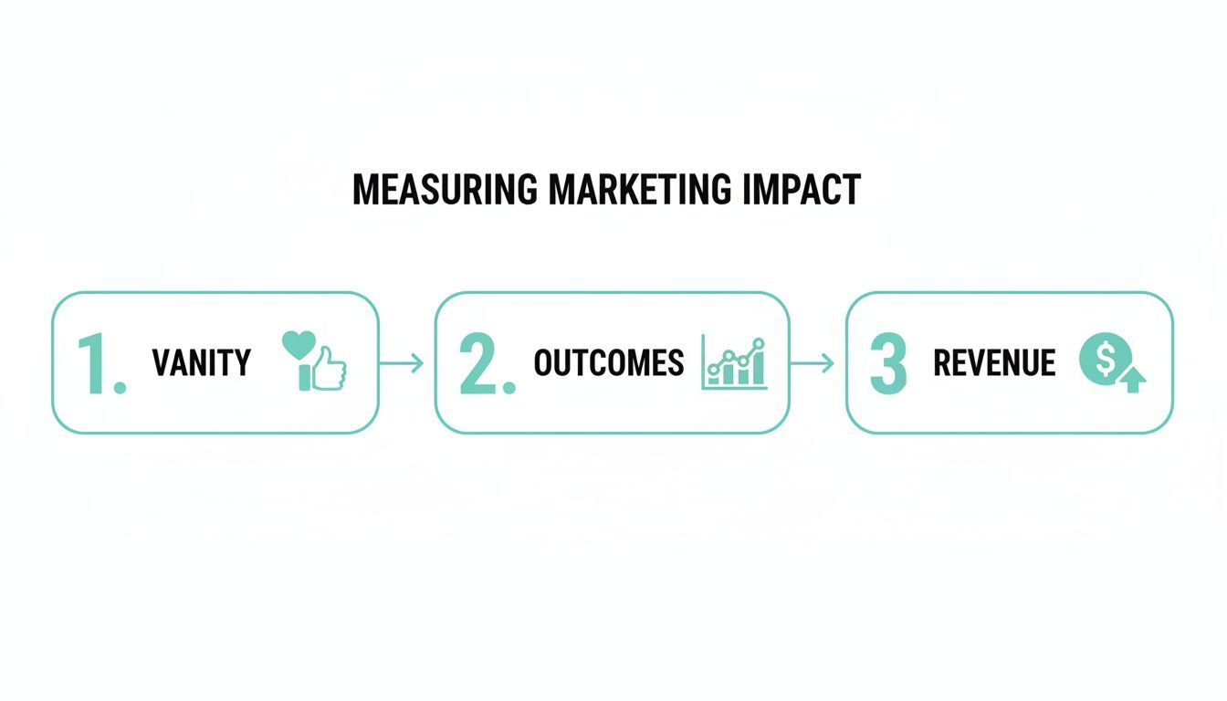
The flowchart reinforces a core principle of effective measurement: sustainable growth comes from connecting marketing actions directly to the bottom line.
Applying a Measurement Mindset in SharePoint
While a platform like SharePoint serves a different primary purpose than Sitecore's DXP, the same measurement principles absolutely apply, especially for internal communications and collaboration portals. The trick is to be intentional about what you track.
Instead of just monitoring page views on an intranet article, focus on the desired outcome. For example, are employees actually downloading the new benefits guide? Are they completing the mandatory training module you linked on the homepage? You can achieve this by integrating SharePoint with external analytics tools and setting up clear goals. The objective is always the same: connect digital activity to a meaningful business action.
By focusing on outcome-driven metrics, you transform your measurement framework from a historical report card into a forward-looking roadmap. It tells you not just what happened, but what you should do next to drive growth.
Ultimately, measuring digital marketing effectiveness is about building a culture of accountability. Every campaign, piece of content, and design choice should be tied to a clear hypothesis about how it will move the needle on a core business objective. Whether you're using the deep capabilities of a platform like Sitecore or applying a strategic framework to SharePoint, you can finally prove the undeniable value marketing delivers.
Getting Your DXP Ready for Flawless Data Capture

Powerful insights are built on a foundation of clean, reliable data. Before you can even think about measuring your marketing effectiveness, you have to get the technical groundwork right. It’s non-negotiable.
A poorly configured platform is like a faulty compass—it doesn't matter how well you navigate if it's pointing you in the wrong direction from the start. This setup is the difference between guessing which campaigns are working and knowing with absolute certainty.
Mapping the Customer Journey in Sitecore xDB
If you're using Sitecore, the Experience Database (xDB) is the central nervous system for all your customer data. To really tap into its power, you need to translate your business objectives into a concrete tracking framework using goals, events, and outcomes.
Goals: These are the big-ticket actions directly tied to your KPIs. We're talking about things like "Completed Purchase," "Submitted Demo Request," or "Downloaded Whitepaper." Every goal needs an Engagement Value (EV) score, which we covered earlier, to quantify its importance.
Events: Think of these as the digital breadcrumbs users leave behind. They're smaller interactions that signal interest but aren't the final conversion. Examples include "Watched 50% of a Video" or "Used On-Site Search." These micro-interactions add critical context to the customer journey.
Outcomes: These track major business milestones that might happen offline or over a longer period. For instance, a "Contract Signed" outcome can be pushed into xDB after the sales team closes a deal that started online. This is how you directly connect digital efforts to actual revenue.
Setting these up in Sitecore's Marketing Control Panel is your first step. It moves you beyond just tracking page views and helps you understand the subtle, winding paths different users take on their way to becoming customers.
Practical Data Capture in SharePoint Environments
For teams running on SharePoint, getting this level of detail requires a more integrated approach. SharePoint doesn't have Sitecore's native marketing suite, but it can become an incredibly powerful data source when you connect it to the right external analytics tools.
A common and highly effective route is to integrate SharePoint with a platform like Power BI for analytics or by deploying tracking scripts to capture user interactions. This allows you to define custom events that align with your business goals. You could, for example, configure event tracking for every time someone downloads a specific document or interacts with a custom web part, feeding this data into an analytics dashboard.
The trick is to treat your SharePoint site—whether it's an internal hub or a public-facing portal—just like any other digital property. By setting up smart, custom event tracking, you can measure content engagement, user adoption, and even the success of internal comms campaigns with surprising accuracy.
To give you a better idea of how this looks in practice, here’s how core KPIs might map across both Sitecore and SharePoint.
Core KPI Mapping for Sitecore and SharePoint
This table provides a snapshot of how to track essential KPIs for different business goals within both Sitecore and SharePoint environments.
This mapping ensures that no matter which platform you use, your tracking is consistently aligned with your overarching business objectives.
Standardizing Your Data Foundation
Regardless of your platform, data consistency is everything. If you don't get two things right from the very beginning, your data will become a polluted mess, making any meaningful analysis impossible: UTM parameters and consent management.
UTM Parameter Governance
A chaotic approach to UTM tagging is a recipe for disaster. It leads to fragmented reports where "email," "Email," and "e-mail" all show up as different channels. You need to establish a clear, documented naming convention for every single campaign.
This simple structure ensures every click is attributed correctly, giving you clean data to analyze channel performance.
Consent and Compliance
Modern privacy regulations aren't optional. Your consent management platform (CMP) has to be configured to respect user choices while still capturing anonymous or aggregated data where it's allowed. In Sitecore, this means ensuring that tracking and personalization rules only fire based on user consent to avoid compliance headaches and maintain data integrity.
Pulling all these different data streams together is often a huge challenge. Getting expert guidance on customer data integration solutions can provide a clear path forward, helping you build a resilient and compliant framework for measurement.
Decoding Your Data with Smart Analytics and Attribution

So, you've got clean data flowing into your DXP. That's a huge win, but it's only half the battle. Now comes the tricky part: turning all those raw numbers into a strategy that actually makes sense. This is where marketing attribution enters the picture. It’s all about giving credit where credit is due across the many touchpoints that lead to a conversion.
Get it wrong, and you’ll end up pouring money into channels that look good on paper but do little for your bottom line. It’s a classic mistake.
Most businesses start with simple attribution models because they're easy, but they often paint a misleading picture. Last-touch attribution, for instance, gives 100% of the credit to whatever a customer did right before converting. It completely ignores everything that came before. Then there's first-touch attribution, which does the opposite—crediting the very first interaction and overlooking all the crucial nurturing that followed. Both models are simple, sure, but they’re fundamentally flawed because they just don't capture the messy reality of a modern customer journey.
A slightly better option is a multi-touch model like linear attribution, which spreads the credit evenly across every touchpoint. It’s fairer, but it still treats a casual blog visit with the same importance as a high-intent demo request. To get the real story, you need the kind of sophisticated tools built into a mature DXP like Sitecore.
Visualizing the Customer Journey in Sitecore
Sitecore Analytics helps you move past these simplistic models by showing you the actual, often chaotic, paths your users take. The Path Analyzer is a perfect example of this. It creates interactive flow diagrams that map out the most common sequences of pages and events leading to your goals.
Instead of just knowing a user converted, you can trace their entire journey step-by-step:
- They first landed on your site from an organic search for a specific problem.
- Over the next two weeks, they came back and read three different blog posts.
- They finally signed up for a webinar after seeing a personalized call-to-action on their third visit.
- A week later, they clicked a link in a follow-up email to request a quote.
This kind of detail is pure gold. It helps you spot your best-performing content, identify drop-off points, and understand which channels are doing the heavy lifting at each stage of the funnel. To truly nail this, it helps to leverage dedicated attribution platforms and their evaluation framework to understand the impact of every single touchpoint.
Uncovering these hidden journeys is where you find the real ROI. You might discover that your top-of-funnel blog content, which last-touch models completely ignore, is actually the most common starting point for your highest-value customers. That insight alone can justify your entire content marketing budget.
Applying Attribution Principles in SharePoint
SharePoint doesn't have a native Path Analyzer, but that doesn't mean you're out of luck. You can still apply attribution principles by integrating it with external analytics platforms. By sending custom event data from SharePoint to a tool like Power BI, you can build custom reports to track user flows and see how different internal channels perform.
For example, you could analyze which internal communication channels—say, a homepage banner versus an email newsletter—are most effective at driving employees to new resources on your SharePoint intranet. The setup is definitely more manual, but the strategic goal is the same: connect actions to outcomes. For a deep dive into how different analytics tools compare, check out this comparison between Sitecore CDP & Personalize and Google Analytics.
From Insights to Hyper-Personalization with Sitecore Personalize
Here’s where it all comes together. The real power of attribution in Sitecore is its ability to turn insights directly into action. Once you’ve identified a valuable customer segment or a common conversion path, you can use that knowledge from Sitecore CDP and Sitecore Personalize to create hyper-personalized experiences that guide users forward.
Real-World Scenario
Let’s say your Path Analyzer reveals that users who download your "Advanced SEO Techniques" whitepaper and later attend a related webinar are 50% more likely to become customers.
Armed with that data, you can immediately build a personalization rule in Sitecore:
- Trigger: A user downloads the "Advanced SEO Techniques" whitepaper.
- Action: The next time they visit, show them a prominent banner promoting the upcoming webinar.
- Follow-Up: Automatically add them to an email nurture sequence that highlights key takeaways from the webinar.
This proactive approach transforms attribution from a backward-looking report into a forward-looking, revenue-driving engine. You're no longer just measuring digital marketing effectiveness; you're actively shaping it in real time.
Building Dashboards That Tell a Compelling Story
Raw data is just noise. A clear story is what convinces stakeholders and drives decisions. Your analytics platform might hold terabytes of information, but without effective visualization, those insights stay locked away. This is where well-designed dashboards come in—they transform complex datasets into compelling narratives that communicate performance and persuade leadership.
The goal here is to move beyond routine reporting. We want to create strategic tools that demonstrate the undeniable value marketing delivers by pulling together all your disparate data sources into one cohesive view.
Creating a Unified View with Power BI
For organizations running on platforms like Sitecore and SharePoint, just connecting the data is the first major hurdle. Sitecore xDB holds rich behavioral data, your CRM has the customer lifecycle story, and SharePoint might track internal content engagement. Tools like Microsoft Power BI are perfect for unifying these streams.
Using Power BI, you can forge a direct connection to your Sitecore databases and SharePoint lists. This lets you pull in and combine metrics like:
- Sitecore Engagement Value (EV) scores: Correlate high EV with specific customer segments from your CRM.
- Goal Conversions: Map marketing-driven goals in Sitecore directly to closed-won opportunities in your sales system.
- SharePoint Content Metrics: See which internal documents are most frequently accessed by the sales team, proving marketing's role in sales enablement.
This integration creates a single, holistic view of your entire marketing engine, from the first touchpoint to the final sale. You can finally answer crucial questions like, "Which Sitecore personalization rules are actually generating the most valuable leads, according to our CRM data?"
Tailoring Dashboards for Different Audiences
One of the most common mistakes is the one-size-fits-all dashboard. An executive doesn't need to see click-through rates on a specific email campaign, and a channel manager needs way more than a high-level ROI number. Effective dashboards are always tailored to their audience.
The Executive Dashboard (The "So What?")
This dashboard is all about the bottom line. It should be clean, visual, and focused on a handful of core business KPIs that tell a story at a glance.
- Primary Metrics: Marketing-Sourced Revenue, Customer Acquisition Cost (CAC), Customer Lifetime Value (LTV), and overall ROI.
- Visualization: Think simple. Use clean line charts showing trends over time and big, bold "scorecard" numbers for immediate understanding.
- The Narrative: This report must answer one question, and one question only: "Is marketing driving profitable growth?"
The Channel Manager Dashboard (The "Why?")
This is the deep-dive tool for tactical optimization. It needs to be granular, interactive, and focused on channel-specific performance.
- Primary Metrics: Conversion Rates by Channel, Cost Per Lead (CPL), Engagement Metrics (e.g., time on page for SEO content), and A/B test results from Sitecore.
- Visualization: Get into the weeds here. Include detailed tables, funnel visualizations, and filters that let managers drill down into specific campaigns or time periods.
- The Narrative: This dashboard answers: "Which specific tactics are working, which aren't, and why are we seeing these results?"
By creating audience-specific views, you transform reporting from a data dump into a strategic conversation. You give each stakeholder exactly the information they need to make informed decisions, which builds trust and shows marketing has a firm command of the data.
Best Practices for Dashboard Design
Clarity is everything. A confusing dashboard is worse than no dashboard at all because it leads to misinterpretation and bad decisions.
Stick to these simple design principles to make sure your dashboards tell a clear and accurate story:
- Start with the Key Question. Every chart on your dashboard should exist to answer a specific business question. If it doesn't, get rid of it.
- Use Visual Hierarchy. The most important KPI—like ROI or MQLs—should go in the top-left corner. That's where the eye naturally goes first.
- Provide Context. A number on its own is meaningless. Use trend lines to show performance over time and include targets or benchmarks to signal whether the results are good, bad, or average.
- Keep It Simple. Avoid clutter at all costs. Use plenty of white space and limit your color palette. A clean design makes the data much easier to digest.
Building these visualizations requires a deep understanding of both data flow and business needs. If you’re focused specifically on e-commerce, you might find our ultimate guide to real-time e-commerce dashboards helpful for exploring more advanced concepts.
Calculating True ROI to Prove Marketing's Value
This is where the rubber meets the road. All your measurement efforts culminate in connecting marketing activities directly to the business's bottom line. When you can translate KPIs and analytics into hard financial metrics, you officially shift marketing from a perceived cost center to a primary engine for revenue growth. The key to making that happen is a solid grasp of what is Return on Investment (ROI).
To really prove your value, you'll need to calculate two critical metrics using the rich data captured inside your DXP: Customer Acquisition Cost (CAC) and Customer Lifetime Value (LTV).
Calculating CAC with DXP Data
Customer Acquisition Cost (CAC) tells you exactly how much you’re spending, on average, to bring a new customer through the door. The formula itself is pretty simple:
CAC = Total Marketing & Sales Spend / Number of New Customers Acquired
Your Sitecore DXP is the source of truth for the denominator in this equation. The total number of "New Customers Acquired" can be tied with precision to specific goal completions—think a "First Purchase" goal in Sitecore or a custom event you've set up in an integrated SharePoint environment. Just be sure your "spend" figure includes everything: ad costs, team salaries, and any software subscriptions from that acquisition period.
Understanding LTV in Sitecore and SharePoint
Customer Lifetime Value (LTV) is a forward-looking metric that predicts the total revenue you can reasonably expect from a single customer over their entire relationship with you. Calculating it is how you demonstrate the long-term impact of your marketing efforts.
A straightforward way to calculate it is:
LTV = (Average Purchase Value x Average Purchase Frequency) x Average Customer Lifespan
In a platform like Sitecore, this data is often right at your fingertips. If you're using Sitecore Experience Commerce, for instance, it tracks the entire purchase history tied to individual user profiles in the xDB. For SharePoint, this data typically comes from integrating your CRM, which lets you segment users and calculate LTV for customer cohorts that originated from specific marketing activities tracked on your platform.
For a healthy, sustainable business model, you're aiming for an LTV to CAC ratio of at least 3:1. If your LTV is $3,000 and your CAC is $1,000, you're in great shape. If that ratio dips closer to 1:1, you’re essentially losing money on every new customer you acquire. We dive deeper into these financial metrics in our guide to using a DXP ROI calculator for measuring digital investment impact.
Highlighting Channel-Specific ROI
While overall ROI is the big-picture number everyone wants to see, drilling down into channel-specific ROI is where you find the insights to optimize your budget. This analysis consistently shows that channels like SEO and email marketing punch well above their weight in terms of efficiency and performance.
The data backs this up. SEO leads have a remarkable 14.6% close rate, which absolutely dwarfs what you see from outbound methods. To drive the point home, 49% of businesses report that organic search delivers the best ROI of all their marketing channels.
Within a platform like Sitecore, this isn't just a vague feeling—it's provable. You can directly attribute goal conversions and their associated Engagement Value to the "organic search" channel. This gives you concrete evidence to justify continued, and even increased, investment in content and technical SEO. By building a business case with these hard numbers, you're no longer just talking about traffic; you're proving marketing’s direct contribution to financial success.
Driving Continuous Growth Through Smart Experimentation
Effective measurement isn’t the finish line; it’s the starting block for a continuous cycle of improvement. Once you have clean data and a clear view of your ROI, the real work begins. It's time to turn those insights into action with a structured approach to experimentation. This is how you build a culture where data—not guesswork—guides every strategic move you make.
A platform like Sitecore is practically built for this kind of iterative process. Its native A/B testing and personalization features are incredibly powerful, letting you experiment with almost any element of the user experience. You can easily test different headlines, hero images, calls-to-action, or even entire component layouts to find out what truly drives engagement and boosts conversion rates.
Leveraging Sitecore for Optimization
In Sitecore, you can run tests directly on your live content, which is a huge advantage. Imagine you want to optimize a landing page form. You could create two versions: one with a short, direct form and another with a multi-step approach. Sitecore handles the rest, automatically serving these variations to different user segments and tracking which one generates more submissions. It even declares a winner based on statistical significance. All the manual effort is gone, leaving you with clean, reliable results.
The real magic happens when you pair testing with personalization. An initial A/B test might show that a "Request a Demo" CTA outperforms "Contact Us." That's a great start. But you can then create a personalization rule to show that winning CTA specifically to visitors showing high-intent behavior, maximizing its impact where it matters most.
Practical Experimentation in SharePoint
Even if you're working in a SharePoint environment, you can still embrace a testing mindset. While it doesn't have Sitecore's slick, integrated toolset, you can run manual A/B tests on content and design. For example, create two versions of an important announcement or a new resource page. Publish them at different times or to different user groups, and then measure engagement using your analytics setup.
The goal here is the same: make small, iterative improvements that boost user adoption and prove the value of your content. This kind of continuous optimization is what ensures your digital marketing effectiveness is always trending upward.
Common Questions About Marketing Measurement
How Often Should I Review My Digital Marketing Metrics?
There's no single right answer here—it all comes down to what the metric is for. The cadence should match the metric's purpose.
For the big-picture KPIs that steer your strategy, like ROI and Customer Lifetime Value (LTV), a monthly or quarterly review is usually best. This gives you enough data to spot meaningful trends without getting lost in the daily noise.
When it comes to channel performance metrics—things like conversion rates or cost per acquisition—you'll want to keep a closer eye on them. A weekly check-in is a good rhythm, as it lets you make timely tweaks to your campaigns before you burn through your budget.
And then there's the real-time stuff, like website traffic. This is something you should glance at daily. It’s your first line of defense for catching technical glitches or sudden traffic spikes that need immediate attention.
What Is The Biggest Mistake In Measuring Marketing Effectiveness?
By far, the most common pitfall is getting fixated on vanity metrics. We've all seen it: chasing social media likes or celebrating total site visits without ever tying those numbers back to what actually matters to the business.
Effective measurement draws a clear, unbroken line from every single marketing activity to a tangible outcome, whether that’s qualified leads, sales, or revenue. If you can't connect the dots, you're just tracking noise.
Another huge mistake is ignoring data quality. If your data is inaccurate or incomplete, any insights you pull from it will be flawed. This leads to poor strategic decisions, wasted marketing spend, and missed opportunities for growth. It’s a classic "garbage in, garbage out" scenario.
The core principle of effective measurement is that every tracked metric must justify its existence by answering a crucial business question. If it doesn't inform a decision, it's just noise.
Can I Measure Marketing On SharePoint Without Sitecore's Tools?
Absolutely. It's a common misconception that you need a full-blown DXP like Sitecore to get meaningful marketing analytics. While SharePoint doesn’t have the same native, all-in-one marketing suite, you can absolutely build a powerful measurement setup.
The trick is to integrate SharePoint with best-in-class third-party tools. By connecting your environment to platforms like Google Analytics, your CRM, and your marketing automation software, you can track everything you need—from user behavior and content engagement all the way to lead generation.
It does require more upfront configuration than an out-of-the-box DXP solution. But once it's set up, you’ll have the robust insights required to prove the business value of your content and your platform.
Ready to build a measurement framework that proves your marketing's true impact? Kogifi specializes in configuring Sitecore and SharePoint environments for flawless data capture and strategic analysis. Contact us today to turn your data into your most powerful asset.