

In today's competitive digital landscape, a superior user experience (UX) is no longer a luxury-it's the core of a successful enterprise platform. The difference between a user who converts and one who leaves often comes down to intuitive design, seamless interaction, and a deep understanding of their needs. This guide delves into the 10 most critical best practices in user experience UX design that are essential for crafting high-performing digital platforms.
Specifically, we'll explore how these principles can be masterfully implemented within powerful ecosystems like Sitecore and SharePoint. By focusing on these proven methodologies, businesses can transform their digital presence from a simple content repository into a dynamic, personalized, and engaging experience engine. The principles discussed here are fundamental, but their application varies across different platforms. For a deeper dive into practical application on mobile platforms, explore these comprehensive App Design Best Practices.
For organizations leveraging complex platforms like Sitecore, mastering these UX principles is paramount for maximizing ROI, driving user adoption, and achieving ambitious business goals. The following roundup provides actionable insights to help you build interfaces that are not only functional but also delightful to use. We will cover everything from user-centered design and information architecture to the finer points of accessibility and microinteractions. This structured approach ensures you can effectively audit your current digital properties or lay a solid foundation for new projects, ensuring every digital touchpoint is optimized for success.
1. User-Centered Design
User-centered design (UCD) is an iterative design philosophy that places the user at the absolute center of every decision. Instead of relying on internal assumptions, this approach demands a deep, empathetic understanding of your audience's needs, behaviors, and motivations. Following UCD principles is a fundamental best practice in user experience UX design because it directly links your design decisions to real-world user problems, ensuring the final product is not only usable but genuinely valuable.

The UCD process involves a continuous cycle of research, design, prototyping, and testing. It begins with understanding the context of use, specifying user requirements, creating design solutions, and then evaluating those designs against the identified requirements. This loop repeats, with each iteration refining the product based on direct user feedback.
Why It's a Top UX Best Practice
Embracing UCD is essential for any modern digital strategy, particularly for platforms built with sophisticated systems like Sitecore or SharePoint. For instance, when designing a customer portal in Sitecore, a UCD approach shifts the focus from "what features can we build?" to "what tasks does our customer need to accomplish easily?" This mindset ensures that personalization rules in Sitecore Personalize are configured to solve real user problems, rather than just showcasing technical capabilities. The result is higher engagement, increased conversions, and improved customer loyalty.
"You’ve got to start with the customer experience and work back toward the technology, not the other way around." - Steve Jobs
Actionable Implementation Tips
- Conduct User Research Early: Start with stakeholder interviews, user surveys, and competitive analysis before a single wireframe is drawn.
- Develop Data-Driven Personas: Create detailed user personas based on actual research. In a Sitecore implementation, these personas can be directly mapped to profile cards and pattern cards to drive personalization.
- Prototype and Test Continuously: Use low-fidelity wireframes or interactive prototypes to gather user feedback. In a Sitecore project, this means testing information architecture and key user journeys before committing to development.
- Leverage Analytics: After launch, use tools like Sitecore Analytics or SharePoint usage reports to monitor user behavior, identify pain points, and inform future iterations.
2. Information Architecture
Information Architecture (IA) is the art and science of organizing, structuring, and labeling content in a digital product to support usability and findability. A well-designed IA acts as a blueprint, making it intuitive for users to navigate complex information spaces and understand their location within the system. This practice is a cornerstone of effective user experience UX design because it creates a logical, predictable framework that prevents user frustration and cognitive overload.
Effective IA is the invisible foundation of a great user experience. It encompasses the creation of navigation systems, hierarchies, categorizations, and metadata. By carefully planning how information is presented, you guide users to their goals efficiently, whether they are browsing product categories on an e-commerce site or searching for a specific document on a corporate intranet.
Why It's a Top UX Best practice
A strong IA is crucial for enterprise-level platforms like Sitecore and SharePoint, which often manage vast amounts of content. For a multinational corporation using Sitecore XM Cloud, a clear IA ensures that content authors can manage global and regional content logically, while customers can easily find relevant products or articles. Similarly, in a SharePoint-based document management system, a well-defined IA with consistent metadata and folder structures prevents the system from becoming an unmanageable digital landfill. The result is improved user satisfaction, better content discovery, and increased operational efficiency.
"Good information architecture enables people to find and do what they came for. Great information architecture takes find out of the equation so they can just do." - Jeffrey Zeldman
Actionable Implementation Tips
- Conduct Card Sorting Exercises: Engage target users in card sorting activities to understand their mental models. This helps group and label content in a way that aligns with their expectations, directly influencing the taxonomy and content tree structure in a Sitecore implementation.
- Create Comprehensive Sitemaps: Before beginning visual design, develop a detailed sitemap that outlines the entire structure of the site or application. This serves as a critical blueprint for both design and development teams.
- Use Consistent Naming Conventions: Establish and adhere to a clear and consistent vocabulary across all navigation labels, headings, and links. In SharePoint, this consistency is vital for building effective search refiners and managed navigation.
- Implement Multiple Pathways: Acknowledge that users have different behaviors. Provide multiple ways to access content, such as primary navigation, contextual links, and a robust search function powered by tools like Sitecore Search.
3. Accessibility (A11y) and Inclusive Design
Accessibility (A11y) is the practice of making digital products usable by everyone, including people with disabilities. Inclusive design is a broader methodology that considers the full range of human diversity. Integrating these as best practices in user experience UX design means moving beyond simple compliance to create experiences that are genuinely equitable and welcoming for all users, regardless of their abilities, context, or background.

This approach involves designing with empathy for diverse needs, such as those related to vision, hearing, motor skills, and cognitive function. It follows established guidelines like the Web Content Accessibility Guidelines (WCAG) to ensure content is perceivable, operable, understandable, and robust. Proactively designing for a wider audience often leads to a better experience for every user.
Why It's a Top UX Best Practice
Beyond the ethical and legal imperatives, accessibility enhances brand reputation and expands your market reach. In a Sitecore context, building an accessible website from the ground up ensures that powerful features like personalization and multilingual support are available to all users. For example, ensuring that dynamic content loaded by Sitecore Personalize is announced by screen readers makes a personalized experience inclusive. In SharePoint, accessible design for an intranet ensures every employee, regardless of ability, can access vital company information, fostering a more inclusive workplace culture.
"The power of the Web is in its universality. Access by everyone regardless of disability is an essential aspect." - Tim Berners-Lee
Actionable Implementation Tips
- Audit Early and Often: Use automated tools and manual testing with keyboard-only navigation and screen readers like NVDA. Sitecore's component-based architecture allows for testing components individually for compliance before they are widely used.
- Provide Text Alternatives: Ensure all non-text content, like images managed in Sitecore's media library, has descriptive alt text fields that are required for content authors.
- Design for Color Contrast: Use tools to check that text and background color combinations meet WCAG contrast ratio standards, ensuring readability for users with low vision.
- Build Accessible Forms: In Sitecore Forms or SharePoint lists, ensure all fields have clear, programmatically associated labels and that error messages are specific and helpful. For a deeper understanding of designing for everyone, explore comprehensive inclusive design principles for accessible, engaging UX to guide your strategy.
4. Usability Testing and Validation
Usability testing is a systematic method of evaluating a product by testing it on real users. It’s about observing people as they attempt to complete tasks, identifying where they struggle, and using that data to validate design decisions. This crucial practice in user experience UX design moves your process from guesswork to evidence-based refinement, ensuring the final product isn't just theoretically sound but works effectively in the real world.
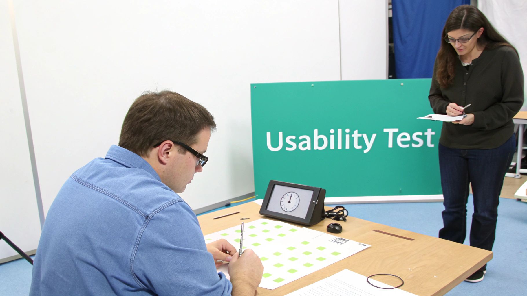
The process can take many forms, from moderated, in-person sessions to unmoderated remote tests and quantitative methods like A/B testing. By integrating regular testing cycles, teams can uncover friction points, validate assumptions, and iteratively improve the user experience before costly development resources are committed. This validation step is non-negotiable for creating intuitive and successful digital platforms.
Why It's a Top UX Best Practice
Incorporating usability testing is critical when working with powerful but complex systems like Sitecore and SharePoint. For a Sitecore Commerce site, for example, usability testing can reveal if customers can easily navigate product categories, understand the checkout process, or use personalized features as intended. Assumptions about a "simple" user journey can be quickly invalidated by observing just a few users, saving significant time and budget. Similarly, for a SharePoint intranet, testing can ensure employees can find critical documents or access internal tools without frustration, directly impacting organizational productivity.
"Testing with one user is 100% better than testing with none." - Steve Krug
Actionable Implementation Tips
- Test Early and Often: Use low-fidelity wireframes or interactive prototypes to gather feedback on core concepts and information architecture. This allows for cheap, rapid changes before any code is written.
- Recruit Representative Users: Test with participants who match your target audience personas. Testing with the wrong audience can yield misleading or irrelevant feedback.
- Use a Mix of Methods: Combine qualitative methods (like moderated tests to understand the "why") with quantitative data (like A/B testing within Sitecore Personalize) to understand the "what."
- Focus on Critical User Journeys: Prioritize testing high-value tasks, such as the registration process on a Sitecore portal or the search functionality on a SharePoint document hub. A comprehensive evaluation of these key areas is often part of a detailed user experience audit checklist.
5. Consistency and Design Systems
Consistency is a cornerstone of intuitive design, creating a sense of predictability that allows users to learn an interface once and apply that knowledge across the entire product. A design system is the ultimate tool for achieving this, acting as a single source of truth for design. It is a comprehensive collection of reusable components, standards, and guidelines that dictate how a brand's digital products should look and behave. This is one of the most critical best practices in user experience UX design because it eliminates inconsistencies that confuse users and erode trust.
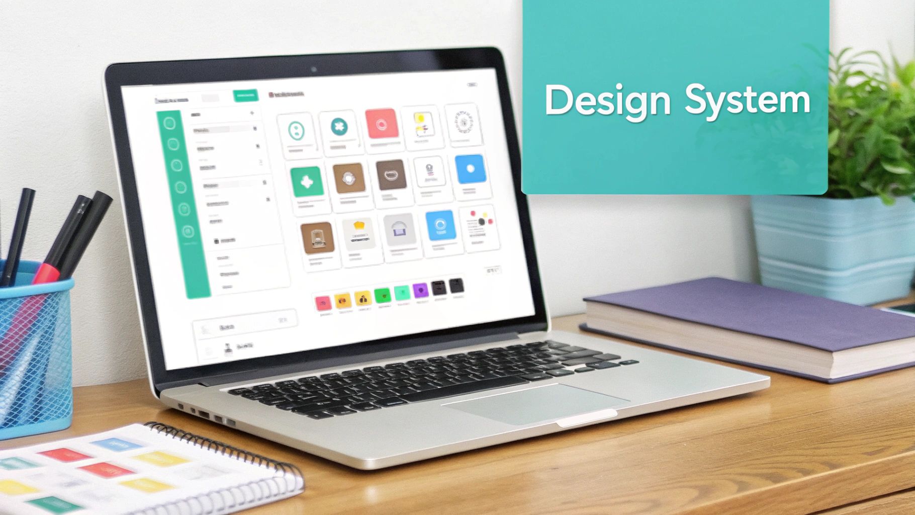
This centralized library goes far beyond a simple style guide. It includes everything from UI components like buttons and forms to code snippets, typography scales, color palettes, and interaction patterns. A robust system can unify a product suite, speed up development, and allow teams to focus on solving complex UX problems instead of reinventing basic elements.
Why It's a Top UX Best Practice
Implementing a design system is particularly powerful for complex enterprise platforms like Sitecore and SharePoint. For a large organization using Sitecore to manage multiple brand sites, a design system ensures a consistent brand experience across every digital touchpoint. For instance, a "call to action" component defined in the system will look and function identically whether it’s on a campaign landing page, a product detail page, or a personalized component in Sitecore Personalize. This consistency streamlines the content authoring experience and provides a seamless, predictable journey for the end-user.
"A design system isn’t a project. It’s a product, serving products." - Nathan Curtis, EightShapes
Actionable Implementation Tips
- Start with an Interface Audit: Begin by cataloging all existing UI components across your digital properties to identify inconsistencies and establish a baseline.
- Establish Clear Governance: Define a process for how new components are proposed, approved, and added to the system. This ensures it remains a reliable source of truth.
- Build for Your Platform: When working with Sitecore, develop your components using the Sitecore Experience Accelerator (SXA) or a headless approach with Next.js. This ensures they are reusable, themeable, and fully compatible with the platform's content management and personalization capabilities.
- Provide Comprehensive Documentation: Your design system is only as good as its documentation. Include clear guidelines, usage examples, and code snippets to make adoption easy for both designers and developers.
6. Mobile-First and Responsive Design
Mobile-first design is a strategic approach that prioritizes designing for the smallest screen first and then progressively enhancing the experience for larger devices. This philosophy, combined with responsive design techniques, ensures a seamless and optimized user experience across all screen sizes, from smartphones to desktops. This is a non-negotiable best practice in user experience UX design today, as mobile devices often represent the primary touchpoint for a majority of users.
The process starts by defining the core content and functionality for the mobile view, forcing designers to focus on what is truly essential. As the screen real estate increases, the design can be enhanced with additional features, more complex layouts, and richer content. This ensures the mobile experience is fast and focused, rather than a stripped-down version of a desktop site.
Why It's a Top UX Best Practice
Adopting a mobile-first mindset is critical for platforms like Sitecore, where personalization and component-based architecture are key. When you design for mobile first, you build a solid, performance-optimized foundation. Components are inherently flexible, making them easier to adapt for tablet and desktop views within Sitecore's Experience Editor. This approach directly aligns with Google's mobile-first indexing, improving SEO performance while also drastically enhancing usability for on-the-go users, leading to lower bounce rates and higher engagement. For example, a responsive e-commerce site built on Sitecore OrderCloud ensures a frictionless checkout process whether on a phone or a laptop.
"What is the core of this? What is the core functionality? What is the core content? Let's start there, and then we can enhance from that." - Luke Wroblewski
Actionable Implementation Tips
- Prioritize Content Ruthlessly: On a small screen, you can only show what's most important. Identify the primary call-to-action and essential information for every page.
- Design with Touch in Mind: Ensure all interactive elements like buttons and links are large enough to be easily tapped. A minimum size of 44x44 pixels is a widely accepted standard.
- Use a Flexible Grid: In Sitecore, leverage the responsive grid capabilities of SXA or modern front-end frameworks to create adaptable layouts that content authors can easily manage. Learn more about how to build responsive layouts with AEM and apply similar principles in your chosen CMS.
- Test on Real Devices: Emulators are useful, but nothing beats testing your design on actual smartphones and tablets to identify real-world performance issues and usability quirks.
7. Clear and Intuitive Navigation
Clear and intuitive navigation is the digital equivalent of a well-designed map. It helps users understand where they are, where they can go, and how to return to a previous point. This best practice in user experience UX design focuses on creating a predictable, consistent, and logical structure that requires minimal cognitive effort from the user. Effective navigation, encompassing everything from primary menus to breadcrumbs, is the backbone of a usable website, directly impacting task completion rates and user satisfaction.
A site’s navigation system should feel invisible yet supportive, guiding users toward their goals without causing confusion. When navigation is done well, users can explore complex digital ecosystems confidently. When it’s done poorly, even the best content or features can become inaccessible, leading to high bounce rates and user frustration.
Why It's a Top UX Best Practice
For enterprise-level platforms like Sitecore, clear navigation is non-negotiable. A large corporate website or a multi-brand e-commerce portal built on Sitecore can contain thousands of pages and components. A well-structured information architecture and navigation system ensure that all this content is discoverable. It enables personalization strategies to function effectively; for example, a personalized component promoting a service is useless if the user cannot easily navigate to that service page. In a SharePoint intranet, intuitive navigation is critical for employee adoption, helping them find documents, resources, and collaboration spaces efficiently.
"If the user can’t find it, it doesn’t exist." - Thorsten Kujath
Actionable Implementation Tips
- Keep It Simple: Limit your primary navigation menu to a maximum of 5-7 items to avoid overwhelming users.
- Conduct Card Sorting: Use card sorting exercises with real users to inform your information architecture. This ensures your navigation structure aligns with user mental models, not internal company jargon.
- Indicate Current Location: Use visual cues like color changes, bold text, or breadcrumbs to clearly show users where they are within the site hierarchy. In Sitecore, this can be dynamically generated based on the content tree.
- Leverage Mega Menus in Sitecore: For complex sites, use Sitecore's component-based architecture to build well-organized mega menus. These can display a large number of options in a structured, multi-column layout, improving scannability.
- Implement Robust Search: For content-heavy SharePoint or Sitecore sites, a powerful and easily accessible search function, like Sitecore Search, is a crucial part of the navigation strategy.
8. Microinteractions and Feedback
Microinteractions are the small, often subtle, product details that accomplish a single task and provide immediate feedback. These contained moments, from a button’s hover state to a form field’s validation message, are crucial for a responsive and intuitive interface. A well-executed microinteraction acknowledges a user's action, prevents errors, and can even inject a moment of delight, transforming a functional experience into a memorable one. This is a core best practice in user experience UX design because it makes a system feel alive and intelligent.
These small details collectively have a massive impact on the overall user experience. Examples are everywhere: the gentle vibration when you toggle a switch on iOS, the loading animation that keeps you informed, or Slack's "user is typing" indicator. Each one serves a purpose by communicating status, providing guidance, or simply confirming that an action was successful, thereby building user trust and confidence in the platform.
Why It's a Top UX Best Practice
Implementing thoughtful microinteractions is essential for sophisticated platforms like Sitecore, where complex user journeys are common. For instance, when a user interacts with a personalized component powered by Sitecore Personalize, a subtle animation can confirm that their preference has been registered. This immediate feedback reassures the user that the system is responding to their input, reinforcing the value of the personalized experience. Without this feedback, users might wonder if their actions had any effect, leading to confusion and frustration.
"The details are not the details. They make the design." - Charles Eames
In a SharePoint environment, microinteractions can significantly improve document management tasks. A clear "upload complete" message with a subtle green checkmark provides instant confirmation, while an animated progress bar makes waiting for a large file to upload more tolerable. These details reduce cognitive load and make enterprise software feel more user-friendly and modern.
Actionable Implementation Tips
- Provide Clear Feedback: Ensure every user action receives an immediate and clear reaction. A button should change state when clicked, and forms should validate input in real-time.
- Keep Animations Swift: Animations should enhance, not hinder. Aim for durations under 300ms to keep the interface feeling snappy and responsive.
- Use Motion to Guide Attention: Use animation strategically to draw the user’s eye to important information, such as a newly appeared notification or a critical error message.
- Ensure Accessibility: Provide options for users to reduce or disable motion if they are sensitive to it. In e-commerce, where clarity is key, learn more about designing microinteractions on kogifi.com to guide users smoothly through checkout.
9. Clear and Effective Error Handling
Error handling is a critical aspect of user experience that determines how a system communicates problems to its users. Instead of showing cryptic codes or dead ends, effective error handling clearly explains what went wrong, why it happened, and provides a direct path to resolution. This approach is a core best practice in user experience UX design because it transforms a moment of frustration into a constructive, guided interaction, building user trust and preventing abandonment.
Great error handling is more than just a message; it's a conversation that empathizes with the user's situation. It avoids technical jargon, uses a human tone, and proactively offers solutions. By anticipating potential issues and designing clear recovery paths, you can maintain a seamless user journey even when things don't go as planned.
Why It's a Top UX Best Practice
Implementing clear error handling is crucial for complex platforms like Sitecore, where users interact with sophisticated forms and personalized content. For example, a poorly explained error on a Sitecore Form can cause a high-value lead to abandon the submission. In contrast, a well-designed form will use real-time validation to provide specific, helpful messages like "Please enter a valid business email" as the user types, preventing the error from occurring in the first place. This thoughtful approach significantly improves form conversion rates and enhances the overall customer experience.
"A user interface is like a joke. If you have to explain it, it’s not that good." - Martin LeBlanc
Actionable Implementation Tips
- Be Specific and Constructive: Instead of a generic "Invalid Input," your message should state exactly what is wrong and how to fix it, like "Your password must be at least 8 characters long."
- Preserve User Input: When an error occurs after a form submission, ensure the user's correctly entered data is preserved. Forcing them to re-enter all information is a major source of frustration.
- Validate in Real-Time: For Sitecore Forms, enable inline validation that provides immediate feedback as users fill out fields, preventing submission errors altogether.
- Use Visual Cues: Combine clear copy with visual indicators like color (e.g., highlighting the problematic field in red) and icons to quickly draw the user's attention to the issue.
10. Performance and Loading States
Performance and loading states are critical components of user experience that focus on how quickly a digital product responds to user interactions. This encompasses everything from the initial page load speed to the feedback provided during data processing. Optimizing performance involves minimizing file sizes, streamlining code, and reducing server response times, while effective loading states manage user perception and reduce frustration during unavoidable waits. This is a non-negotiable best practice in user experience UX design because poor performance directly leads to user abandonment and a negative brand perception.
A performant experience feels seamless and professional, reinforcing user trust. Even a delay of a few seconds can be the difference between a conversion and a bounce. The key is a dual approach: make the system as fast as possible, and for any remaining delays, communicate clearly with the user through visual feedback like skeleton screens, progress bars, or spinners.
Why It's a Top UX Best Practice
Speed is a feature, not an afterthought. In a Sitecore environment, performance optimization is paramount, especially for large-scale enterprise sites with personalization and component-based architectures. A slow-loading, personalized component built with Sitecore Headless can negate the benefits of the targeted content it displays. Similarly, a SharePoint intranet that takes too long to load documents or search results will see a sharp decline in employee adoption. By focusing on performance, you ensure that the sophisticated features of these platforms enhance, rather than hinder, the user journey.
"The two most important things in life are good friends and a strong bullshit detector. To that, I would add a third: a fast-loading website." - Jason Fried
Actionable Implementation Tips
- Audit Core Web Vitals: Use tools like Google's PageSpeed Insights to measure real user metrics (LCP, FID, CLS) and identify performance bottlenecks in your Sitecore or SharePoint solution.
- Optimize Media Assets: Use Sitecore's built-in image optimization tools or create optimized renditions. Ensure all images are compressed and served in modern formats like WebP.
- Implement Smart Loading: Use lazy loading for images and components that appear below the fold. In Sitecore, this can be configured at the component level to defer loading non-critical content.
- Leverage Caching Strategies: Configure Sitecore's various caching layers (HTML, data, item) aggressively to minimize server processing time. For more information, explore our detailed guide on how to optimize website performance on kogifi.com.
- Design Clear Loading States: Use skeleton screens for page and component loads to provide a perception of speed. For actions like form submissions, use spinners or progress indicators to give immediate feedback.
Comparison of 10 UX Best Practices
Partnering for UX Success in Your Enterprise
The journey through the best practices in user experience UX design, from establishing a user-centered foundation to refining the smallest microinteractions, reveals a core truth: exceptional UX is not a feature, but a holistic philosophy. It is the deliberate, continuous effort to understand, anticipate, and fulfill user needs at every single touchpoint. Implementing these principles, however, goes beyond simple checklist completion, especially within complex enterprise ecosystems.
We've explored ten foundational pillars:
- User-Centered Design: Placing the user at the heart of every decision.
- Information Architecture: Creating logical, intuitive content structures.
- Accessibility (A11y): Ensuring equal access for all users.
- Usability Testing: Validating designs with real-world feedback.
- Design Systems: Maintaining consistency and efficiency at scale.
- Mobile-First Design: Prioritizing the primary user context.
- Intuitive Navigation: Guiding users effortlessly toward their goals.
- Microinteractions: Providing meaningful, delightful feedback.
- Error Handling: Turning friction into a helpful, guided experience.
- Performance Optimization: Respecting the user's time with speed.
Mastering these concepts is not just about building better websites or applications; it's about building stronger relationships with your audience. It's about demonstrating respect for their time, understanding their context, and ultimately, earning their trust and loyalty.
From Principles to Platform: The Enterprise Challenge
For organizations leveraging powerful Digital Experience Platforms (DXPs) like Sitecore or collaborative hubs like SharePoint, these best practices take on new dimensions of complexity and opportunity. The true potential of these platforms is only unlocked when a deep understanding of UX is fused with expert technical implementation.
This is where the principles we've discussed become mission-critical. For instance, User-Centered Design is the bedrock for leveraging Sitecore's personalization engine. Without a profound understanding of user segments, their goals, and their pain points, personalization efforts become guesswork. Similarly, a robust Information Architecture is essential for managing the vast content repositories within SharePoint, ensuring that employees can find the information they need to be productive.
"In the enterprise space, UX is not just a design discipline; it is a core business strategy. It dictates how effectively your technology investments in platforms like Sitecore and SharePoint translate into measurable outcomes like customer conversion, employee productivity, and brand loyalty."
Achieving this synergy requires a partner who is fluent in both the language of design and the technical intricacies of the platform. It demands an integrated approach where UX strategists, designers, and developers work in lockstep to transform abstract principles into tangible, high-performing digital experiences. Whether it's implementing a comprehensive Design System to unify your brand across multiple Sitecore sites or conducting rigorous Usability Testing on a new SharePoint intranet, the goal remains the same: to create a seamless, intuitive, and effective experience for the end user.
Your Next Steps on the Path to UX Excellence
The path to UX maturity is an ongoing commitment to improvement, testing, and iteration. As you move forward, focus on embedding these best practices into your organization's culture. Start by asking critical questions: Are we genuinely listening to our users? Is our digital experience accessible to everyone? How can we make our navigation clearer and our load times faster?
By consistently prioritizing these elements, you transform your digital platforms from simple tools into powerful assets that drive engagement, foster loyalty, and deliver significant business value. This is the ultimate goal of applying the best practices in user experience ux design. It’s about creating digital products and services that people not only use but truly enjoy.
Ready to elevate your Sitecore or SharePoint platform with world-class UX? Kogifi specializes in translating these best practices into high-performing digital realities, ensuring your technology investment delivers maximum impact. Connect with our experts at Kogifi to start building your next exceptional user experience today.