

You already have the data. Sitecore is tracking visits, goals, campaigns, forms, and engagement signals. SharePoint is logging document access, search behavior, and content usage. Yet a simple leadership question still turns into a workshop, three exports, and a debate about whose dashboard is right.
That usually isn't a data collection problem. It's a modeling problem.
In DXP programs, a common bottleneck is often that interaction data, customer attributes, and content context live in different shapes across different systems. A personalization team wants to know which audience segment responded to a Sitecore experience. An IT lead wants trusted reporting across regions. A content owner wants to see whether SharePoint knowledge content reduces support friction. Those answers depend on whether the warehouse stores business events cleanly and connects them to the right descriptive context.
That's where facts and dimensions in data warehousing become practical, not theoretical. They give teams a structure for turning noisy platform data into something marketers can trust, analysts can query, and AI models can use without constant cleanup.
Table of Contents
- From DXP Data Chaos to Business Clarity
- A simple way to think about them
- Fact tables vs dimension tables at a glance
- Why DXP teams care
- Grain decides what you can answer later
- Not every number belongs in a fact table
- History changes the meaning of performance
- Star schema for most DXP reporting
- Snowflake schema when dimensions need more control
- Galaxy schema for cross-journey analysis
- Sitecore AI needs clean event structure
- SharePoint analytics becomes useful when context is modeled
- Where teams usually get ROI
- Do facts and dimensions still matter in cloud warehouses
- Are star schemas still relevant for modern DXP analytics
- What should you do with conversion rates and similar KPIs
From DXP Data Chaos to Business Clarity
A familiar pattern shows up in enterprise DXP work. Sitecore has rich behavioral data. SharePoint holds a large share of internal content and operational knowledge. CRM, commerce, forms, and campaign systems add even more context. The organization has plenty of signals, but very little agreement.
Marketing sees campaign results one way. BI sees them another way. IT gets pulled in to reconcile identifiers, timestamps, and content labels. Personalization slows down because no one trusts the audience and outcome data enough to automate decisions against it.
That's why dimensional modeling still matters. The issue usually isn't volume. It's that the warehouse hasn't been shaped around business questions. If your organization is also trying to enrich first party data with external web signals, teams often need a reliable method for unblocking web data with API so those inputs can enter the pipeline in a controlled form instead of as one-off manual extracts.
A practical DXP data model starts by deciding what occurred, then attaching the business context needed to analyze it. In most organizations, that also means solving identity and source consistency before any dashboard redesign. Work like customer data integration solutions matters because a warehouse can't answer customer questions if the same person appears under different identifiers across Sitecore, CRM, and SharePoint-connected systems.
Clean reporting starts when the warehouse reflects business events, not application tables.
Once that structure is in place, basic executive questions stop being difficult. You can trace which campaign drove a high-value form completion, which content asset supported conversion, which region responded differently, and whether a personalization rule improved outcomes over time. Facts and dimensions don't just organize data. They make DXP investment measurable.
Understanding Fact and Dimension Tables
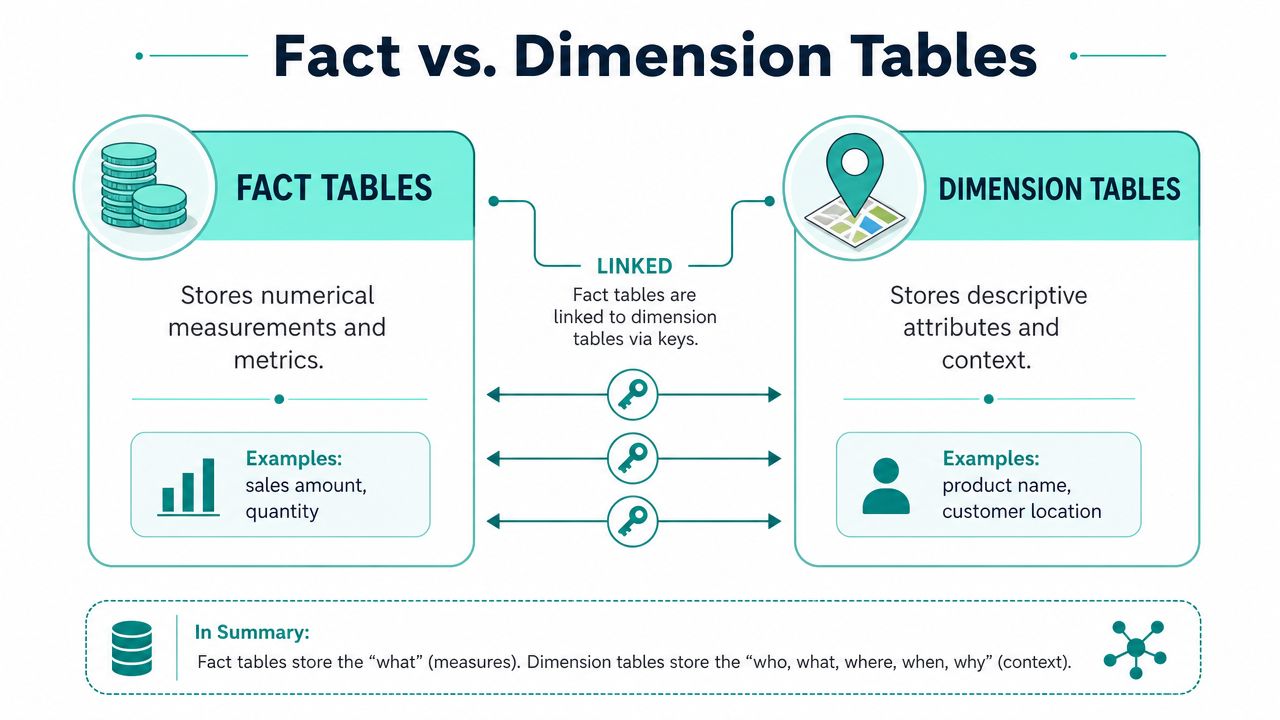
A fact table stores measurable business events. A dimension table stores the descriptive context around those events.
That distinction has shaped data warehousing for decades. A foundational milestone came in 1996, when Ralph Kimball's The Data Warehouse Toolkit popularized organizing data around fact tables and dimension tables, a model Microsoft still endorses for summarizing measures like sum, count, and average in analytics workloads, as described in this history of fact and dimension modeling.
A simple way to think about them
Use a retail receipt as the simplest analogy.
The measurable parts are facts. Quantity, price, discount, tax, total. The descriptive parts are dimensions. Product, store, date, cashier, customer.
In a DXP context, the same pattern applies:
- Fact example in Sitecore: page view, goal completion, form submission, order event, email click
- Fact example in SharePoint: document view, document download, search click, page visit
- Dimension example: visitor, campaign, content item, department, device, geography, date
Here's a visual comparison that makes the split easier to see.
For teams reviewing warehouse design choices, this overview of optimizing data infrastructure is useful because it clarifies where dimensional models fit in the wider platform architecture. The same principle applies when planning event tracking in Google Analytics, because event definitions should align with the business events you intend to model downstream.
Fact tables vs dimension tables at a glance
| Characteristic | Fact Table | Dimension Table |
|---|---|---|
| Purpose | Stores measurable events | Stores descriptive context |
| Typical content | Counts, amounts, durations, event records | Names, categories, segments, hierarchies |
| Query role | Aggregated and analyzed | Used to filter, group, and label |
| Shape | Usually narrow and large | Usually wider and smaller |
| Change pattern | Grows quickly with each event | Changes more slowly |
| Common DXP examples | page views, conversions, downloads | campaign, visitor, content, date, geography |
A short explainer can help if your stakeholders need a visual walkthrough before they look at schema diagrams.
Why DXP teams care
If you model facts and dimensions well, business users ask simpler questions and get faster answers. They can compare conversion events by campaign, see content engagement by region, or analyze document usage by department without navigating a maze of source-system joins.
If you model them badly, every report becomes custom work. Teams start exporting flat files from Sitecore, SharePoint, analytics tools, and CRM. Definitions drift. Trust drops.
Practical rule: Facts tell you what happened. Dimensions tell you what it meant in business terms.
Key Properties That Drive Analytics Power
Definitions are the easy part. The hard part is making choices that still work when your Sitecore estate expands, your SharePoint taxonomy changes, and leadership wants historical reporting that survives reclassification and audience changes.
Grain decides what you can answer later
The most important design choice in a fact table is its grain. Grain defines the atomic level of each row. In practical terms, it answers the question: what does one record represent?
Microsoft's guidance is clear that the granularity of a fact table, determined by its dimension keys, defines the atomic level of analysis. A finer grain offers more flexibility but increases row volume, while a coarser grain reduces cost and limits drill-down detail, as explained in this fact table granularity guidance.
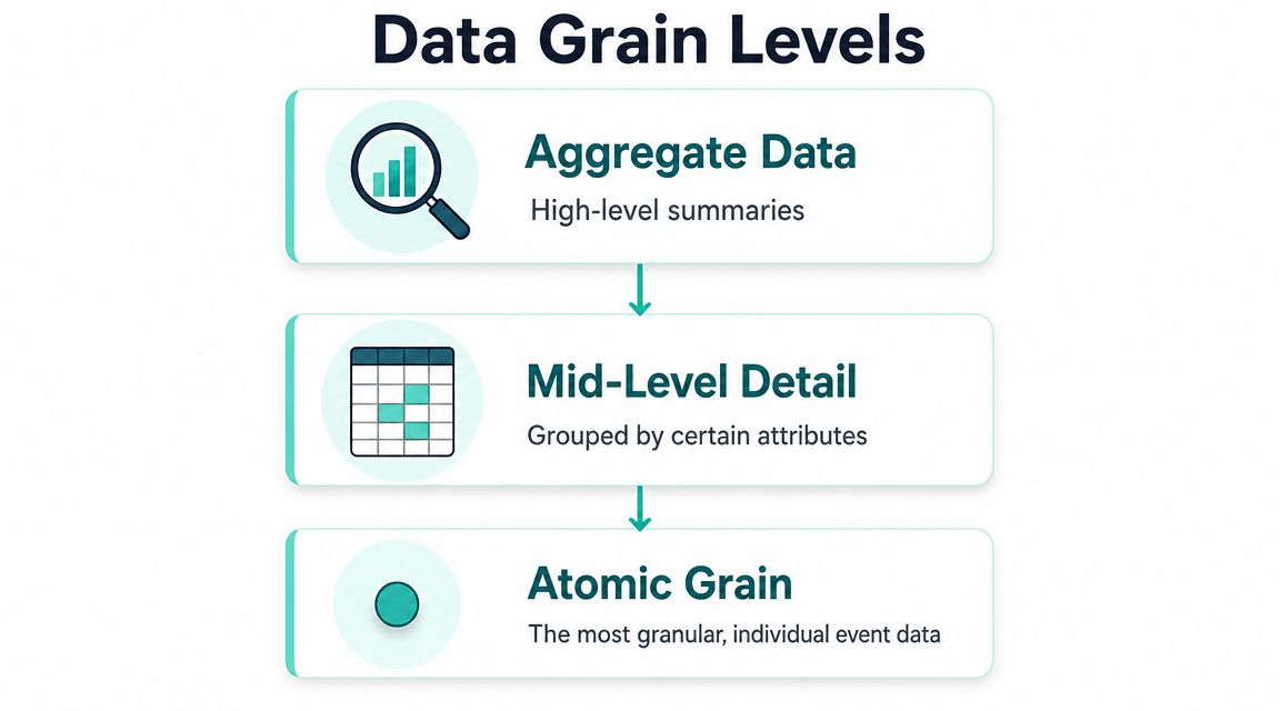
In Sitecore, grain choices often look like this:
- Atomic event grain: one row per page view, form submit, or goal trigger
- Session grain: one row per visit or session
- Daily summary grain: one row per day, per campaign, per market
Each works for a different purpose. Atomic grain supports segmentation, journey analysis, and AI-driven decisioning. Session grain is useful for visit-level behavior. Daily summaries can speed executive reporting but won't support detailed behavioral questions later.
Choose the lowest grain you can govern well. It's easier to roll data up than to recreate detail you never stored.
Not every number belongs in a fact table
A common mistake is assuming that every metric can be stored as a fact. That's not true.
Some measures are additive. Counts and amounts usually fit that pattern. They can be summed across dimensions. Others are non-additive. Ratios and percentages often fall into this category, which means storing the finished KPI can create bad totals and misleading reports.
This matters a lot in marketing and commerce reporting. Teams often want to store conversion rate, average order value, margin percentage, or engagement score directly in the fact table. That usually breaks down when analysts aggregate across campaigns, products, or regions.
A safer pattern is:
- Store the underlying measurable events.
- Store the numerator and denominator where appropriate.
- Calculate the ratio at query time or in the semantic layer.
That approach preserves trust. If a regional marketing lead asks why the global conversion rate doesn't match the sum of market dashboards, your model should make the answer obvious instead of forcing rework.
History changes the meaning of performance
Dimension attributes don't stay still. Customer segment changes. Product category changes. Territory definitions change. A SharePoint content owner moves a document set under a new taxonomy. A Sitecore audience definition is revised.
If the warehouse overwrites every change, historical reporting shifts underneath you. Last year's campaign performance starts reflecting today's segment rules rather than the rules that were active when the event happened.
That's where slowly changing dimensions matter in practice. When history must be preserved, teams use approaches such as Type 2 to keep prior versions of dimensional attributes available for accurate reporting over time. In real DXP programs, this is often the difference between “our dashboard changed” and “our dashboard is historically correct.”
Structuring Your Data with Dimensional Modeling Schemas
Once facts and dimensions are clear, the next decision is how to arrange them. The right schema depends on query behavior, governance needs, and how many business processes you want to analyze together.
The broader logic of dimensional modeling has held up because it's built for scale. Numeric, additive fact tables connect to descriptive dimensions that answer who, what, where, and when, making the model effective for consistent enterprise analytics, as outlined in this explanation of dimensional modeling for large-scale reporting.
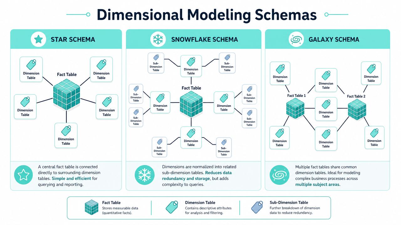
Star schema for most DXP reporting
A star schema puts a fact table in the middle and links it directly to denormalized dimensions.
For most Sitecore and SharePoint analytics use cases, this is the best place to start. It's easy for analysts to understand, performs well for common reporting patterns, and aligns with how BI tools expect business data to be shaped.
A typical Sitecore star might include:
- Fact table: fact_interaction
- Dimensions: dim_visitor, dim_campaign, dim_content, dim_device, dim_date
That gives marketing teams a straightforward path to answer questions like which campaigns influenced conversions by audience and device.
Snowflake schema when dimensions need more control
A snowflake schema normalizes parts of the dimensions into related tables. You might split geography, product hierarchy, or organizational taxonomy into separate structures.
This can help when a dimension has independent governance or complex hierarchies. In SharePoint, for example, a document classification model may be managed centrally across business units and languages. Separating those hierarchies can improve maintainability.
The trade-off is usability. More joins mean more complexity. That cost is often acceptable for governed enterprise dimensions, but not for every analytics mart.
Galaxy schema for cross-journey analysis
A galaxy schema, sometimes called a fact constellation, uses multiple fact tables that share conformed dimensions.
This is often where mature DXP programs end up. One fact table tracks Sitecore web interactions. Another tracks commerce orders. Another tracks SharePoint document engagement. Shared dimensions like customer, date, geography, and campaign make cross-process analysis possible.
That opens up more strategic questions:
| Need | Likely schema fit |
|---|---|
| Fast marketing dashboarding | Star |
| Deep hierarchy control | Snowflake |
| Cross-channel journey and ROI analysis | Galaxy |
A galaxy model is especially useful when leadership wants to connect top-of-funnel engagement, content consumption, and downstream business outcomes in one reporting layer.
Applying Dimensional Models to Sitecore and SharePoint Analytics
Modeling then moves from abstract to affecting platform value. A DXP can only personalize, report, and optimize well if its warehouse reflects customer behavior and content context in a form the business can readily use.

Dimension tables are typically denormalized so analysts can slice facts by business attributes without repeated joins back to source tables, which improves read performance for analytics workloads, as described in this overview of dimension table design for analytics.
Sitecore AI needs clean event structure
In Sitecore environments, the warehouse usually has to support several layers of analysis at once. Reporting teams want campaign and content performance. Personalization teams want trusted behavioral inputs. AI-led decisioning needs historical interaction patterns that are stable enough to train and score against.
A practical model often includes facts such as:
- fact_page_view for each content interaction
- fact_goal_conversion for each goal or outcome completion
- fact_form_submission for lead capture and gated content activity
- fact_order_event when Sitecore connects to commerce workflows
Those facts become far more useful when paired with dimensions like:
- dim_visitor for known and anonymous profile context
- dim_campaign for source, initiative, and channel attribution
- dim_content for page, template, content type, taxonomy, and language
- dim_device for experience context
- dim_date for time-based reporting and trend analysis
That structure supports questions Sitecore leaders ask. Which audience segment converted after seeing a personalized experience. Which content type influences qualified form submissions. Which campaign underperforms on mobile in a given region.
For organizations building a unified profile and activation layer, enterprise customer data platform strategy becomes much easier when the warehouse already separates events from business context.
SharePoint analytics becomes useful when context is modeled
SharePoint analytics often stays underused because teams stop at usage logs. They know a file was opened, but not whether it mattered.
A better model treats document engagement as a measurable business process. Facts might capture document view, download, search click, page visit, or acknowledgment event. Dimensions can then provide the meaning:
- department
- business unit
- document type
- authoring team
- audience group
- content lifecycle state
- geography
- date
That lets internal communications, HR, and operations teams ask stronger questions. Which policy content is accessed before support requests rise. Which departments rely on outdated knowledge assets. Which content categories drive repeat visits but low acknowledgment.
Where teams usually get ROI
The payoff usually appears in three places.
First, personalization quality improves because Sitecore decisioning runs on cleaner historical patterns and less ambiguous audience context.
Second, reporting trust rises because marketing, digital, and IT stop reconciling different interpretations of the same event stream.
Third, content investment decisions get sharper. Teams can connect content production and governance effort to measurable outcomes instead of page-level vanity metrics.
Better DXP ROI usually comes from cleaner structure, not more dashboards.
Common Dimensional Design Pitfalls and How to Avoid Them
Most warehouse problems don't come from misunderstanding definitions. They come from shortcuts that seem harmless early and become expensive once personalization, attribution, and executive reporting depend on them.
Modeling mistakes that break trust
One common mistake is pushing too much into a single dimension. Teams create a giant customer or content table because it feels simpler. It usually isn't. The table becomes harder to govern, harder to update, and easier to misuse.
Another is storing business flags carelessly. Low-cardinality indicators such as internal versus external content, campaign classification flags, or simple yes-no attributes often need deliberate handling instead of being scattered across facts in inconsistent ways.
Then there's the ratio problem. Teams store percentages directly in facts because the dashboard needs them today. Later, totals stop making sense across regions or channels. Once users see KPI inconsistencies, trust is hard to win back.
Integration problems that require governance
The bigger challenge in DXP estates is usually source integration. Sitecore, SharePoint, CRM, email tools, identity systems, and commerce platforms rarely agree on identifiers or timing. Microsoft's current guidance emphasizes complexities such as consolidating multiple source systems, deduplicating identifiers, and managing history with slowly changing dimensions, all of which are critical for real-world governance in the warehouse, as described in this dimension modeling guidance for modern warehouse governance.
In practice, strong models depend on a few discipline points:
- Use conformed dimensions: A customer, campaign, or geography dimension should mean the same thing across facts.
- Assign surrogate keys: Don't rely on source identifiers alone when different systems represent the same entity differently.
- Preserve history deliberately: If a customer segment or content classification changes, decide whether reporting should reflect the current state or the historical one.
- Separate collection from interpretation: Raw tracking data isn't the same as trusted analytics data. Transform it before exposing it broadly.
If your digital estate is also tightening privacy controls and browser resilience, server-side tracking becomes relevant because the quality of warehouse modeling depends on how reliably events are collected in the first place.
Governance isn't overhead. It's what keeps one business question from producing three different answers.
Frequently Asked Questions About Facts and Dimensions
Do facts and dimensions still matter in cloud warehouses
Yes. Cloud warehouses change scale and operations, but they don't remove the need for clear business modeling. Facts and dimensions still help teams separate measurable events from descriptive context, which is exactly what marketing, analytics, and personalization teams need.
Are star schemas still relevant for modern DXP analytics
Yes, especially when business users and BI tools need understandable models. Even in cloud-native environments, star schemas remain a practical default for reporting marts built from Sitecore, SharePoint, CRM, and campaign data.
What should you do with conversion rates and similar KPIs
Don't usually store the final percentage in the fact table. A common best practice is to store the numerator and denominator instead, then calculate the ratio at query time for accurate aggregation, as explained in this guidance on handling non-additive measures.
Facts and dimensions in data warehousing still sound basic on paper. In real DXP programs, they're one of the clearest dividing lines between data that only exists and data that drives decisions.
If you're trying to make Sitecore AI, SharePoint, and your wider DXP stack produce trusted reporting and usable personalization data, Kogifi can help you turn scattered platform signals into a warehouse model that supports performance, governance, and measurable ROI.