

You already have dashboards. You already have reports. The problem is that most enterprise content teams still can't answer the questions leadership asks.
Identify which content influences the pipeline. Find where journeys break between channels. Determine which personalization decisions improve outcomes. Learn which regions, products, and audiences deserve more budget. Pageviews and likes won't answer that. In a Sitecore or SharePoint estate, they can even distract teams from the underlying issues.
For enterprise programs, metrics for content marketing need to do one job above all else. They need to connect content operations to business performance in a way that marketing, IT, and leadership can all trust.
Table of Contents
- Why single metrics mislead
- The six categories that matter
- How to use the framework in practice
- What this framework changes
- Start with tracking design, not dashboard design
- The Sitecore AI KPIs that hold up in enterprise reporting
- What strong governance looks like in practice
- Where Sitecore measurement usually breaks down
- How do you measure content ROI in a headless or composable architecture
- What if we're starting with poor data quality
- How should multilingual or multi-region teams handle metrics
- How do we prove AI is adding value in Sitecore
Beyond Vanity Metrics The Enterprise Imperative
Enterprise teams usually inherit a reporting culture built around what is easy to count instead of what is useful to decide. That works for a small campaign. It fails fast when you manage multiple brands, languages, channels, and approval layers across a DXP.
A simple analogy helps. Vanity metrics are like watching a ship's engine RPM. You know something is happening, but you still don't know whether the ship is reaching the right port. Enterprise metrics track the route, the drift, the delays, and whether the cargo arrived where the business needed it.

The business case for treating content as a strategic asset is already strong. Content marketing generates 3x more leads than outbound marketing while costing 62% less, according to Sixth City Marketing research cited by Reportz on content marketing metrics. That changes the conversation. Content is not just publishing output. It's an operating model that deserves the same measurement rigor as paid media, sales operations, or commerce.
Enterprise context changes what counts
In practice, the same metric can mean very different things depending on platform design. A high pageview count on a support article may indicate success if users find answers quickly. The same pageview spike on a product comparison page may mean buyers are circling because the path to action is unclear.
That's why I push teams to stop asking, “How did this page perform?” and start asking these questions instead:
- Business alignment: Did this content support awareness, qualification, conversion, retention, or service deflection?
- Audience quality: Did the right segment consume it, not just any segment?
- Journey effect: Did it move visitors to the next intended step?
- Operational impact: Did content reduce friction for sales, support, or regional teams?
Practical rule: If a metric can't help someone decide what to change next, it's a diagnostic signal, not a KPI.
What doesn't work at enterprise scale
Three habits cause most reporting problems.
- Reporting platform-native numbers without business context: Teams export analytics dashboards and call it strategy.
- Treating all content equally: A news article, a buying guide, and a knowledge-base page should never share the same KPI model.
- Ignoring architecture: Headless delivery, personalization logic, multilingual rollout, and channel handoffs all affect performance interpretation.
If you need a stronger financial lens for leadership conversations, this guide to content marketing ROI from Kogifi is a useful companion to enterprise reporting discussions.
A Unified Framework for Enterprise Content Metrics
Most content programs fail measurement because they jump from raw data to executive reporting without a model in between. The fix is a framework that shows how each metric contributes to a fuller picture.
Why single metrics mislead
A single metric rarely tells the truth on its own. Time on page without next-step behavior is incomplete. Conversion rate without audience source is incomplete. Search visibility without pipeline influence is incomplete.
Think of enterprise measurement as a set of building blocks. One block shows reach. Another shows intent. Another shows action. Once you connect them, you can see whether content is merely visible or commercially useful.
Good reporting separates signals, KPIs, and business outcomes. Teams often mix all three and create noise.
The six categories that matter
| Category | What it answers | Typical enterprise examples |
|---|---|---|
| Consumption | Was the content actually used? | pageviews, unique visits, time on page, scroll depth, asset downloads |
| Engagement | Did the audience interact meaningfully? | return visits, CTA clicks, internal search refinement, video completion, form starts |
| SEO performance | Did search visibility improve discoverability? | impressions, rankings for strategic pages, organic click-through rate, non-brand entry pages |
| Conversion | Did users take the intended next step? | demo requests, newsletter signups, trial starts, contact submissions, assisted conversions |
| Retention | Did content support existing customers or employees? | repeat visits from authenticated users, knowledge-base usage, onboarding completion, policy acknowledgement |
| Revenue attribution | Did content contribute to commercial outcomes? | first-touch influence, multi-touch contribution, opportunity acceleration, content-assisted pipeline |
These categories work because they force teams to classify metrics before they report them. That prevents a common failure mode. Everything gets dumped into one dashboard, and stakeholders can't tell the difference between an activity number and a business indicator.
How to use the framework in practice
I usually recommend assigning each major content type a primary category and one or two supporting categories.
- Thought leadership article: Primary KPI sits in awareness or engagement. Secondary KPI may be assisted conversions.
- Product comparison page: Primary KPI sits in conversion. Secondary KPI may include SEO performance and path progression.
- Support content: Primary KPI sits in retention. Secondary KPI may include search success and service deflection.
- Regional campaign landing page: Primary KPI depends on market objective. Supporting metrics often include localization quality signals and handoff performance.
A useful discipline is to define one metric for quality, one for progression, and one for business impact. That gives teams balance. It also prevents a false win where content attracts traffic but produces weak downstream behavior.
What this framework changes
Once teams adopt this structure, meetings improve. Marketing stops arguing for visibility alone. IT stops being asked to “just add tracking” without a measurement model. Leadership starts seeing how content supports demand, service, and customer experience together.
That's where metrics for content marketing become operational, not decorative.
Mapping Content KPIs to the Enterprise Funnel
The cleanest way to choose KPIs is to map them to the decision a buyer or user is making at that moment. The funnel is still useful for enterprise teams, provided you don't treat it as a straight line. Buyers loop, compare, leave, return, and hand off between channels.
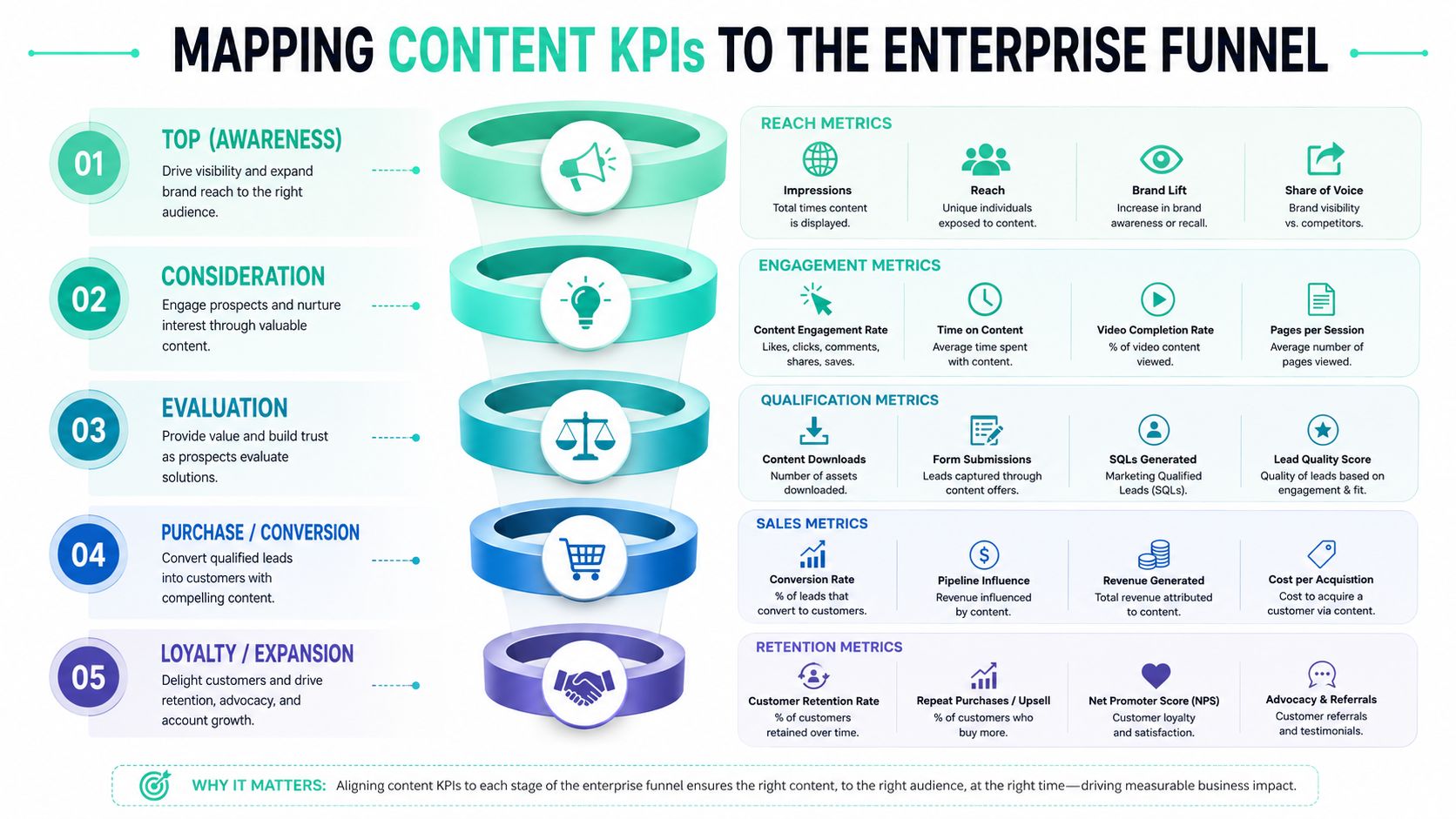
Awareness and consideration
At the top of the funnel, the business question is simple. Are we reaching the right audience and earning enough attention to continue the journey? Many teams at this stage overvalue raw traffic and undervalue fit.
For awareness content, focus on indicators like:
- Qualified reach: traffic segmented by target account, geography, industry, or audience group
- Entry source mix: whether discovery comes from organic search, referral, social, email, or direct
- Content visibility trend: whether strategic topics are gaining discoverability over time
- Brand-adjacent engagement: visits to related product, solution, or about pages after initial content entry
At the consideration stage, the question changes. Are visitors showing buying or adoption intent?
Primary and secondary KPIs often include:
- Return visitation: strong for audiences evaluating a complex purchase
- CTA engagement: clicks to guides, demos, webinar registrations, or product details
- Content path depth: how many relevant content steps a user takes before exiting
- Internal search behavior: what users search after reading, which often exposes missing content or unclear navigation
If awareness content never feeds consideration behavior, it may still have communications value, but it doesn't yet have strong commercial value.
A solid external reference on this journey design is SEOBRO's revenue-driven funnel optimization guide, especially if your team needs a shared vocabulary between acquisition and conversion stakeholders.
Decision and loyalty
Decision-stage measurement needs much tighter definitions. The question is no longer whether people engaged. It's whether content reduced uncertainty enough for action.
For decision content, I look for these KPIs:
- Conversion completion: demo request, form completion, contact action, add-to-cart, quote request, or another defined business event
- Assisted conversion presence: whether the content appears in journeys that later convert
- Sales-enablement engagement: visits to case studies, implementation pages, pricing, or product-fit content before conversion
- Path efficiency: whether users reach action pages without unnecessary detours
- Audience match: whether converters belong to the intended segment
- Device and channel consistency: whether key journeys break on mobile, app handoff, or regional domains
Post-purchase is where many enterprise reporting models stop too early. They shouldn't. Content after the sale often influences renewal confidence, product adoption, support demand, and internal efficiency.
For loyalty and advocacy, useful measures include:
- Customer knowledge usage: repeated engagement with help, onboarding, or training content
- Account expansion signals: engagement with advanced feature, cross-sell, or integration content
- Community and advocacy actions: referrals, testimonials, event participation, or partner sharing
- Search gap patterns: repeated failed or refined searches that signal missing post-sale content
A practical operating model is to assign every major asset one funnel role. If a page tries to do awareness, consideration, decision, and support all at once, reporting gets muddy and optimization gets slower.
If your team is designing KPI structures inside a CMS or DXP, this article on content KPIs for enterprise CMS platforms gives a useful planning baseline.
Deep Dive Measuring Content in Sitecore
A common enterprise scenario looks like this. The team launches personalization in Sitecore, traffic stays healthy, engagement ticks up, and leadership asks a harder question. Did AI improve pipeline, reduce wasted journeys, or lower the cost of getting buyers to the right next step? If reporting cannot answer that, the program is still measuring activity, not business value.
Sitecore earns its place in the stack when it is configured to measure decisions across content, audience, and journey state. In XM, XP, Personalize, Search, and composable implementations around them, the essential KPI model has to connect experience decisions to revenue, progression, and operating efficiency.

Start with tracking design, not dashboard design
Poor Sitecore reporting usually starts in solution design. Templates are created without a clear business purpose. Components are reused across journeys without event logic. By the time stakeholders want answers, analysts are trying to reverse-engineer intent from noisy data.
Set measurement rules at four layers before rollout:
Content type level
Define the job of each template. A campaign landing page, product detail page, insight article, and support article should never share the same success logic.Component level
Track the modules that influence movement. Recommendation carousels, proof-point blocks, calculators, video players, forms, and comparison tables often explain performance better than page averages.Journey level
Specify the expected next action for each context. Sometimes success is a deeper product view. Sometimes it is a profile update, a form start, a sales handoff, or entry into a nurture path.Audience level
Segment by region, persona, account type, known versus anonymous status, lifecycle stage, and buying group role. Aggregate performance hides where personalization is creating value and where it is wasting impressions.
In Experience Analytics, this means disciplined goals, page events, outcomes, and naming conventions. In Personalize, it means every experiment, decision model, and offer needs labels that still make sense six months later, after teams and agencies have changed.
The Sitecore AI KPIs that hold up in enterprise reporting
Generic content metrics are too weak for Sitecore AI. Click-through rate and pageviews can support analysis, but they do not prove whether decisioning improved an enterprise journey. The stronger approach is to measure whether AI changed the path, the quality of progression, or the economics of conversion.
I advise clients to focus on KPIs such as these:
Personalization lift by segment
Compare downstream outcomes for personalized versus non-personalized experiences by audience, market, and intent state. A blended average usually masks underperformance in key segments.Decision influence rate
Measure how often AI or rule-based decisioning changed the experience served. If predictive models exist but influence only a small share of sessions, ROI will be limited no matter how strong the model looks in isolation.Propensity model adoption
Track where scoring is being used in content selection, next-best-action logic, lead routing, or recommendation ranking. This shows whether AI is operationalized or sitting on the shelf.Journey efficiency
Measure pages to conversion, time to high-value action, repeated detours, and abandonment points for personalized versus standard paths. This is often where Sitecore AI proves its value fastest.Component contribution
Identify which renderings consistently assist progression. In many Sitecore estates, recommendation strips, trust modules, and comparison components contribute more commercial value than the page shell around them.Experience fatigue
Watch for falling performance in a variant or offer that keeps serving at high volume. That usually points to stale creative, weak segment logic, or a model that has stopped learning from meaningful signals.
The teams that get reliable ROI from Sitecore report on the decision object itself. They do not stop at page performance. If a model selected the content, ranked the recommendation, or changed the offer, that decision needs its own KPI trail.
For a finance-ready approach to attribution and business case design, use this framework for measuring digital experience ROI in practical terms.
What strong governance looks like in practice
Tooling is only half the job. Governance is what makes the numbers defensible in a steering committee.
Three controls matter most:
- Stable naming standards for campaigns, experiments, components, and goals
- A KPI owner for each major journey or business capability
- Post-release validation after front-end changes, personalization updates, or integration releases
I have seen one small rendering change in a headless Sitecore build break event continuity across multiple markets. The dashboard still loaded. The trend line still looked clean. The interpretation was wrong. Enterprise teams need release checklists that include analytics validation, not just UX and functional QA.
This walkthrough offers a helpful visual overview of Sitecore thinking before you operationalize it in your own program.
Where Sitecore measurement usually breaks down
The first failure point is baseline design. AI cannot prove value if no control group exists, success events are vague, or experiment windows shift every time performance dips.
The second is reporting at the wrong object level. If Sitecore Search changed result ordering, or Personalize selected a different hero and recommendation set, page-level reporting is not enough. Analysts need visibility into which decision ran, who received it, and what happened next.
The third challenge is architectural fragmentation. In composable environments, Sitecore may own presentation and decisioning while commerce, CRM, analytics, and consent data live elsewhere. KPI quality depends on integration quality. Kogifi often supports clients with the implementation and measurement model for that setup, but the fundamental requirement is straightforward: define the system of record for each metric, then keep event definitions consistent across platforms.
Leveraging SharePoint for Content Measurement
SharePoint sits in a different measurement category than Sitecore. It usually supports intranets, knowledge hubs, policy libraries, partner portals, and internal communications. That changes what “success” means.
What SharePoint can tell you out of the box
SharePoint's native usage analytics are often enough to answer several practical questions.
- Which pages employees or partners visit
- Which documents or news posts attract repeat attention
- Which search queries appear often
- Which pages lose traction quickly after launch
- Which sites or hubs become the primary entry point for information
Those signals are useful, but they shouldn't be read as popularity alone. Internal content usually succeeds when it reduces confusion, shortens search effort, and supports a task. A policy page with modest traffic may be more valuable than a news post with broad visibility if it consistently serves the teams who need it.
Where Power BI changes the conversation
SharePoint data becomes more actionable when you connect it to Power BI and model it around internal outcomes. Then you can build dashboards for communications, HR, legal, operations, or IT support without forcing everyone into the same report.
A strong SharePoint reporting setup usually combines:
| Use case | Useful metrics | Why it matters |
|---|---|---|
| Internal communications | page visits, repeat readers, announcement engagement | shows whether employees saw and revisited critical updates |
| Knowledge management | search terms, failed search refinements, article usage | reveals content gaps and findability issues |
| Policy communication | page access by department, acknowledgement actions | helps confirm distribution and compliance communication reach |
| Partner portals | content usage by partner group, document access patterns | shows whether enablement materials are being used |
SharePoint metrics should answer, “Did people complete their task faster or with less confusion?” That's more valuable than asking whether a page was merely visited.
In Microsoft 365 environments, the reporting model also benefits from tying SharePoint usage to Teams communications, search behavior, and document interactions. That creates a more realistic picture of how internal audiences find information. The pattern is simple. Measure discoverability, task support, and repeat utility. Ignore vanity reporting unless it helps diagnose a specific issue.
Best Practices for Dashboards and Reporting
Most enterprises don't have a data shortage. They have a reporting design problem. A 2025 Gartner report notes that 68% of enterprise marketers struggle with DXP metric silos, as cited by Seven Figure Agency's discussion of content marketing impact metrics. That lines up with what we see in practice. Different teams define the same journey differently, then wonder why no one trusts the numbers.
Build dashboards by decision owner
A dashboard should exist to help someone make a decision. If it doesn't, it becomes an archive.
Here's a practical split that works well:
Executive dashboard
Focus on content contribution to pipeline, market penetration, conversion influence, and retention signals. Keep it trend-based and sparse.Marketing leadership dashboard
Show funnel progression, campaign performance, channel contribution, audience segment response, and content mix effectiveness.Content operations dashboard
Include page and asset performance, editorial velocity, metadata quality, CTA interaction, experiment status, and underperforming content queues.IT or DXP dashboard
Track implementation health, tagging coverage, integration failures, search quality issues, taxonomy consistency, and release-related anomalies.
A useful rule is one dashboard, one audience, one set of decisions.
Reporting habits that reduce silo problems
Dashboards alone won't fix siloed reporting. Teams also need common definitions and reporting routines.
- Lock KPI definitions early: “Conversion,” “engaged visit,” and “content assist” need shared meaning across teams.
- Report trends, not isolated snapshots: Single-period reporting creates false urgency and false confidence.
- Separate diagnostics from leadership KPIs: Leadership does not need every content signal. Teams do.
- Annotate major changes: Site releases, campaign launches, tracking updates, and taxonomy changes should be visible in the reporting timeline.
This is also where AI reporting discipline matters. Teams evaluating new tooling can use curated resources like Mifu's overview of top AI marketing tools for 2026 to compare categories and capabilities, but they still need an internal model for what they expect those tools to improve.
A trustworthy dashboard is usually less crowded than the one teams first ask for.
For organizations trying to connect marketing, content, and platform data more coherently, this guide to measuring digital marketing effectiveness is a practical reference point.
Your Implementation and Adoption Strategy
A new measurement model usually fails for human reasons before it fails for technical ones. Teams resist unfamiliar KPIs, executives ask for legacy reports, and platform owners worry about extra complexity. The answer isn't to launch a massive reporting overhaul. It's to stage adoption carefully.
Start with governance not tooling
Begin with a small governance group that includes marketing, content, analytics, and platform owners. They need to agree on four basics:
- Which business questions matter most
- Which content types map to which funnel roles
- Which KPIs are executive-facing versus team-facing
- Who owns definitions, validation, and change control
Without that layer, dashboard work becomes political. Every team pushes its preferred numbers into the report and confidence drops.
Roll out in phases people can absorb
The strongest rollout plans are phased.
- Phase one: Choose a pilot area with clear commercial importance, such as product content, lead generation journeys, or a support knowledge hub.
- Phase two: Standardize naming, event design, and dashboard logic for that pilot.
- Phase three: Review with users, remove noisy metrics, and refine ownership.
- Phase four: Expand to adjacent content types and regions once the reporting language is stable.
Training matters just as much as instrumentation. Editors need to understand why metadata quality affects reporting. Campaign managers need to understand attribution limits. Platform teams need to understand that measurement continuity is a release requirement, not a post-launch extra.
A final practical point. Set initial baselines, even if they're imperfect. Teams adopt new metrics faster when they can compare “before” and “after” within their own environment rather than chase abstract ideals.
Frequently Asked Questions on Enterprise Content Metrics
How do you measure content ROI in a headless or composable architecture
Start by mapping events across systems before you build dashboards. In composable environments, content may live in one platform, experience logic in another, and conversions elsewhere. The KPI model should follow the journey, not the software boundaries. If the architecture fragments the event trail, fix that first.
What if we're starting with poor data quality
Don't wait for perfect data. Pick one journey, define a clean event model, and establish a baseline. Then expand. Most enterprise teams improve faster with one trusted dashboard than with a large but unreliable reporting estate.
How should multilingual or multi-region teams handle metrics
Use a common KPI framework with regional overlays. Keep core definitions stable, then let markets add local context such as language, product mix, campaign timing, or compliance needs. Avoid merging everything into a single average. That hides where content works and where localization needs attention.
How do we prove AI is adding value in Sitecore
Treat AI as a decision layer that needs explicit measurement. Compare personalized versus non-personalized journeys, review segment-level outcomes, and look at downstream progression, not just clicks. If AI changes recommendations, offers, or content order, the report should show whether those decisions improved journey quality or conversion behavior.
If your team is trying to turn content reporting into something leadership can trust, Kogifi can help you design the measurement model, tracking architecture, and dashboard strategy around Sitecore AI, SharePoint, and enterprise DXP delivery.