


When you’re building a high-performance, scalable frontend for an enterprise Digital Experience Platform (DXP), the conversation today almost always starts with Next.js and Tailwind CSS. This isn't just a trend; it's the definitive stack for combining modern development speed with the rock-solid structure needed for complex systems like Sitecore and SharePoint.
Why Next.js and Tailwind Are an Unbeatable Enterprise Duo

For enterprise leaders managing platforms like Sitecore, the constant challenge is delivering rich, personalized experiences without dragging down performance. This is exactly where the Next.js and Tailwind CSS stack shines. It's not just a technical choice; it’s a strategic one that powers the modern composable architecture.
At its core, this combination helps development teams build better and faster. Next.js brings a production-ready React framework to the table, complete with server-side rendering (SSR) and static site generation (SSG)—features that are non-negotiable for top-tier SEO and lightning-fast page loads.
Meanwhile, Tailwind CSS provides a utility-first framework that enforces consistency and dramatically speeds up UI development.
Driving Business Value and Performance with Sitecore AI
When you plug this stack into a DXP, the impact on business outcomes is immediate. Take a Sitecore implementation, for example. The success of its AI-driven personalization, a core feature of Sitecore AI, hinges on speed. If those personalized components load slowly, the user experience suffers, and the entire investment in AI is undermined.
We've architected numerous Sitecore solutions where the Next.js and Tailwind frontend was the key to unlocking the platform's full potential, especially with Sitecore AI. It enables rapid iteration for marketing teams while maintaining the strict performance and accessibility standards required by enterprise-grade applications.
The pairing of these technologies has become a dominant force in modern development for good reason. The widespread adoption is a direct result of the real-world performance gains organizations are seeing, allowing them to fully leverage the power of their DXP.
The Headless Advantage with Sitecore and SharePoint
Pairing Next.js with a headless CMS is where the architecture truly excels. It effectively decouples your frontend presentation layer from the backend content management system. This gives developers the freedom to build amazing user interfaces while content editors can stick to the familiar tools they know, like Sitecore's XM Cloud or Content Hub, or even SharePoint.
Let's quickly summarize how this tech stack delivers value in the context of a DXP.
Next.js & Tailwind CSS at a Glance for Enterprise
| Feature | Benefit for Enterprise DXP Projects | Impact on Business |
|---|---|---|
| Component-Based Architecture | Enables rapid, reusable UI development. | Faster time-to-market for campaigns and features. |
| Server-Side Rendering (SSR) | Improves initial page load times and SEO. | Better search rankings and lower bounce rates. |
| Utility-First CSS | Enforces design consistency and reduces custom CSS. | Stronger brand integrity and lower maintenance costs. |
| Decoupled Frontend | Isolates the presentation layer from the DXP backend. | Increased architectural flexibility and scalability. |
This table only scratches the surface, but it highlights how technical features translate directly into tangible business benefits.
Adopting this decoupled approach unlocks several key advantages:
- Accelerated Development Cycles: Tailwind’s utility classes and the Next.js component model drastically cut the time needed to build and style complex UI elements.
- Enhanced Performance: Next.js features like automatic code splitting, image optimization, and smart data fetching directly improve Core Web Vitals scores.
- Superior Scalability: A decoupled frontend can be scaled independently of the backend CMS, ensuring your digital properties can handle massive traffic spikes without a hiccup.
- Future-Proof Architecture: This stack is built for composable architecture, letting you swap or upgrade parts of your DXP without needing a full-platform rebuild.
This composable mindset is crucial for building a flexible and powerful digital platform. To dig deeper into how this separation of concerns can strengthen your enterprise systems, take a look at our guide on the benefits of a headless CMS.
Ultimately, choosing Next.js and Tailwind CSS isn't just about adopting new tools. It's a strategic decision that pays off in speed, performance, and long-term maintainability for any serious enterprise project.
Architecting Your Next JS Tailwind Project for Scale

Building an enterprise-grade project is more than just running create-next-app. For a project to have any long-term success, especially when you’re integrating with a sophisticated DXP like Sitecore, you need a solid architectural blueprint from day one. Our approach, sharpened over years of building complex frontend solutions, is all about production readiness from the very first commit.
This means setting up your Next.js and Tailwind project in a way that actively prevents technical debt. A clean folder structure isn't just a nicety; it's about building a codebase your whole team can navigate and contribute to without friction. For a deeper dive into these principles, it’s worth reviewing best practices for building scalable React applications.
Key Configuration Files
The first thing you’ll want to do is nail down the configuration files that will act as the brain of your project's styling and build process. These two files, tailwind.config.js and postcss.config.js, are where your frontend architecture really begins to take shape.
tailwind.config.js: Think of this as your project's design system bible. We always extend the default theme to bake in brand-specific colors, fonts, spacing, and breakpoints. This centralizes all design decisions, which is non-negotiable for keeping a large application consistent.postcss.config.js: PostCSS is a powerful tool for transforming CSS with JavaScript. For any enterprise build, our standard setup includestailwindcss,autoprefixerfor handling browser-specific prefixes, and usuallypostcss-importto keep our CSS dependencies organized.
Getting these configurations right from the start ensures every component your team builds will follow the same rules—an absolute must when you're working with component-driven platforms like Sitecore or SharePoint.
By defining your design tokens—colors, spacing, typography—in
tailwind.config.jsfrom the outset, you create a single source of truth. This discipline prevents the style inconsistencies that often plague large-scale projects and simplifies the integration of components from systems like Sitecore's component library.
A Battle-Tested Folder Structure
As a codebase grows, a logical folder structure becomes your best friend. While frameworks offer some defaults, enterprise projects need something more robust. Here's a structure we've found incredibly effective for Next.js and Tailwind projects that are hooked into a DXP.
/src
├── /api # API routes for backend-for-frontend logic
├── /app # Next.js App Router pages
├── /components # Reusable UI components
│ ├── /blocks # Larger, composite components (e.g., HeroBanner)
│ ├── /elements # Atomic components (e.g., Button, Input)
│ └── /layouts # Page layout structures (e.g., MainLayout, TwoColumn)
├── /lib # Helper functions, API clients (e.g., Sitecore SDK)
├── /styles # Global CSS and base styles
└── /types # TypeScript type definitions
This structure creates a clear separation of concerns. Atomic elements are used to build larger blocks, which are then assembled on pages within the app directory. This modular approach is the heart of a composable architecture and works perfectly with an API-first approach when pulling in content from a headless CMS.
Managing Environment Variables
Enterprise applications almost always run in multiple environments—local, staging, UAT, and production. You have to manage configuration across these stages without accidentally leaking sensitive keys. Luckily, Next.js has excellent built-in support for environment variables that makes this straightforward.
We rely on a combination of .env.local for local development secrets and environment-specific files like .env.production for variables needed at build time.
NEXT_PUBLIC_: Use this prefix for any variable that needs to be available in the browser, like a public Sitecore GraphQL endpoint URL.- Without Prefix: Variables without the prefix are server-side only. This is the safe choice for API tokens, secret keys, and other sensitive credentials.
This disciplined approach to architecture—from config files and folder structures to environment management—is the blueprint for a scalable, high-performance Next.js and Tailwind application ready for the demands of any enterprise DXP.
Building a design system that feels both consistent and flexible is the holy grail for any large-scale application. The goal is to enforce brand standards without tying your developers' hands. This is where a Next.js and Tailwind stack truly shines, letting you build a system that speeds up your team instead of getting in their way.
It all starts by creating a single source of truth for your entire visual language. This goes way beyond just picking a few colors. We're talking about codifying the foundational DNA of your brand—spacing units, font sizes, corner radii, shadow styles—directly into your tailwind.config.js file.
Once you do this, that configuration file becomes a set of guardrails for every person touching the code. It's the secret to ensuring that every new component, whether built by an in-house team or a new contractor, speaks the same design language.
Centralizing Design Tokens in Your Configuration
You have to treat your tailwind.config.js file like a core piece of your application's architecture. By extending Tailwind's default theme, you’re creating a custom library of design tokens that are unique to your project. This is how you kill the dreaded "magic numbers" and random hex codes that inevitably creep into a growing codebase.
Instead of developers guessing which shade of blue is the right blue, they can simply use a class like bg-brand-primary or text-brand-accent. This discipline is what separates a good-looking app from a truly scalable design system.
A solid theme extension usually covers these bases:
- Colors: Define your full brand palette—primary, secondary, and accent colors, along with shades for UI states like hover, focus, and disabled.
- Spacing: Establish a rhythmic spacing scale, often based on a 4px or 8px grid. This ensures every margin, padding, and layout gap feels intentional and consistent.
- Typography: Lock in your font families, sizes, weights, and line heights. If you want to dive deeper into how these elements build a cohesive identity, checking out the principles behind effective website style guidelines is a great next step.
With this setup, if marketing decides to tweak the primary brand color next year, you just change it in one place. Every component using that token instantly updates across the entire application, saving you days of painful refactoring.
Creating Reusable and Variant-Driven Components
With your design tokens in place, it's time to build out your component library. The core principle of building consistent design systems revolves around reusable components, a practice deeply understood and implemented by experienced react developers. The trick is to create components that are not just reusable, but also flexible enough to adapt to different contexts.
Take something as simple as a button. A well-designed button component should accept props to control its appearance and size without forcing you to write new CSS.
Example: A Dynamic Button Component
You can build a single button component that handles different visual styles (primary, secondary, destructive) and sizes (sm, md, lg) without ever duplicating a line of code. Using a utility like cva (Class Variance Authority) is an excellent way to cleanly manage how Tailwind classes are applied based on those props.
This lets developers call buttons with simple, readable code:<Button variant="primary" size="lg">Submit</Button><Button variant="destructive" size="sm">Delete</Button>
By composing components from Tailwind's utility classes, you create a system that is both highly customizable and strictly controlled. This approach avoids the rigidity of traditional CSS frameworks, where overriding styles often leads to a messy, unmaintainable codebase.
You can apply this same pattern to just about any UI element you can think of:
- Accessible Modals: Build a single modal component that properly traps focus, listens for the
Escapekey, and manages its own state, all while using your predefined design tokens for styling. - Navigation Menus: Create a responsive nav that gracefully collapses from a full desktop menu to a mobile hamburger, all by using Tailwind's breakpoint prefixes like
md:andlg:. - Data Tables: Design tables with variants for striped rows, hover states, and different cell padding options—all controlled through simple props.
Implementing Practical Theming for Light and Dark Modes
Dark mode is no longer a novelty; it's a common requirement, especially in enterprise apps. Thankfully, Tailwind makes implementing theming remarkably easy. Its built-in dark: variant lets you apply different styles whenever a parent element has a .dark class.
First, you just need to tell Tailwind you want to use a class-based strategy in your tailwind.config.js:darkMode: 'class',
Now, you can write your components to include dark mode styles right in the class string. A card component, for instance, could have a white background in light mode and a dark gray one in dark mode.
<div class="bg-white dark:bg-gray-800"> ... </div>
Toggling the theme is as simple as adding or removing the .dark class from the <html> or <body> element with a bit of JavaScript. We manage this with React's Context API to make the theme state available everywhere in the app. This clean, utility-driven method makes building a robust theming system in your Next.js and Tailwind project both simple and easy to maintain.
Connecting Your Frontend to a Headless DXP
This is where your architecture really starts to sing. A fast, beautifully styled Next.js and Tailwind frontend is great, but it’s only as powerful as the content feeding it. Our real expertise is in bridging that gap, connecting your frontend to headless Digital Experience Platforms (DXPs) like Sitecore to build seamless, high-performance user journeys.
The core idea is simple: treat the DXP as a pure content service. It doesn't matter if it's Sitecore XM Cloud, a custom SharePoint solution, or another headless CMS. The frontend's only job is to ask for structured content and make it look good. This composable model is the bedrock of modern enterprise web development.
Data Fetching Patterns with Sitecore
For a platform like Sitecore, which provides robust GraphQL endpoints, Next.js has the perfect tools for the job. Choosing between getStaticProps and getServerSideProps isn't just a technical footnote; it's a strategic decision that directly shapes performance and user experience.
getStaticPropsfor Static Content: We lean on this for content that rarely changes—think landing pages, "About Us" sections, or blog posts. At build time, Next.js pulls the data from Sitecore's GraphQL API and pre-renders the page as static HTML. This gives you blazing-fast load times and a solid SEO foundation.getServerSidePropsfor Dynamic Content: When a page needs real-time data or personalization,getServerSidePropsis the clear winner. When a user hits the page, the server fetches the latest data from Sitecore before rendering. This is crucial for experiences driven by Sitecore AI, like personalized product carousels or targeted hero banners.
This hybrid strategy lets us deliver the best of both worlds: the raw speed of static for most of the site, plus the dynamic power needed for truly personalized, engaging moments.
Mapping Sitecore Components to React
One of the common hurdles in any headless project is translating components from the DXP into their frontend counterparts. In a Sitecore project, a content editor might build a page using components they know, like a "Feature Block," "Call to Action," or "Testimonial Carousel." Our task is to create a matching React component for each one.
To handle this, we build a dynamic "component resolver" right inside the Next.js app. This utility function inspects the JSON response from Sitecore's Layout Service or GraphQL endpoint and maps each component name to its corresponding React component.
For instance, if the API returns a component named sitecore-feature-block, our resolver knows to render the <FeatureBlock> React component. It then passes the content fields—like the title, text, and image—as props. That <FeatureBlock> component is, of course, styled with our predefined Tailwind CSS classes, ensuring it aligns perfectly with the design system.
This diagram shows how a design system’s core parts—Tokens, Components, and Theming—flow together to create a unified product.
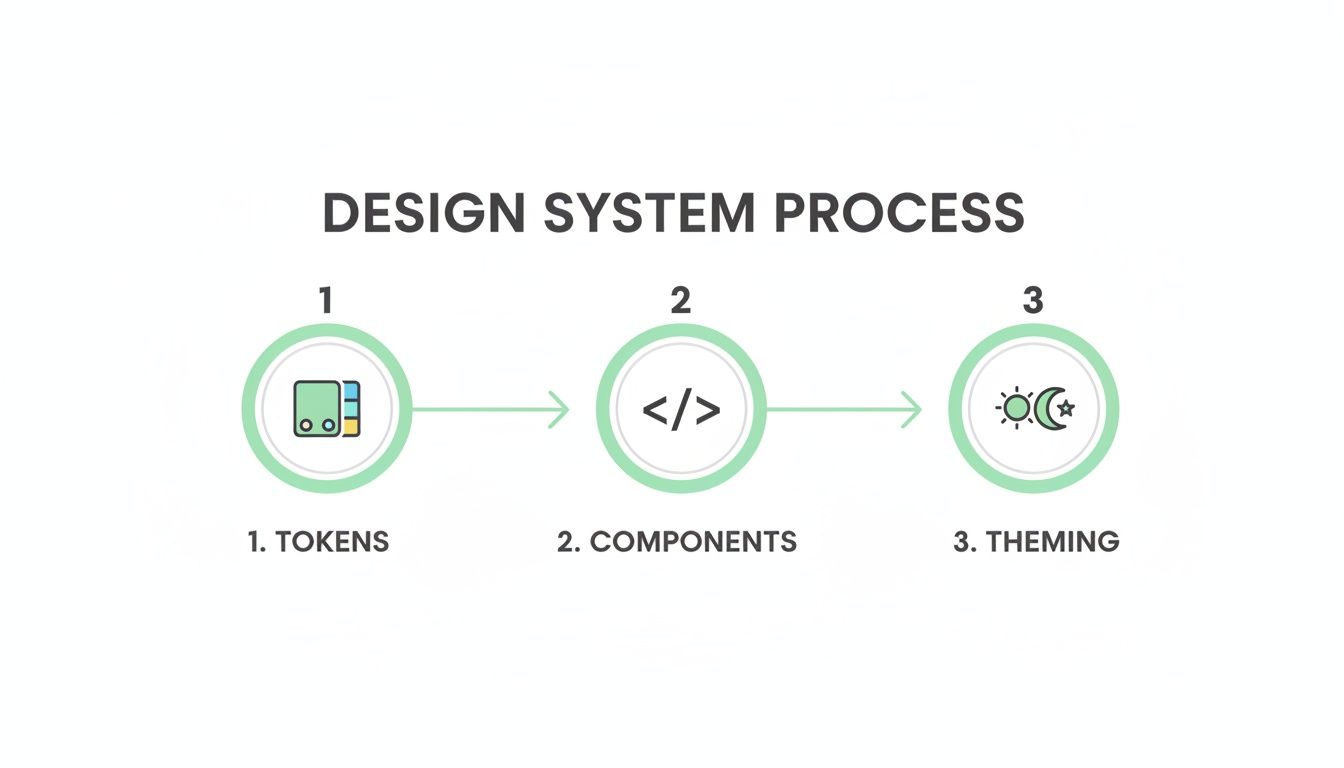
The visualization shows that a solid foundation of design tokens is the true starting point for building consistent, themed components in a Next.js Tailwind project.
Empowering Marketers with Sitecore AI
A composable architecture isn't just a win for developers; it directly empowers marketing teams by unlocking the full power of tools like Sitecore AI.
With a decoupled Next.js frontend, marketers can use Sitecore's familiar interface to run A/B tests, personalize content, and analyze user behavior. The frontend simply renders the variant or content that Sitecore's AI engine determines is best for the current user, without requiring any new code deployments.
This separation is what makes the whole thing work. It gives marketers the agility to optimize user journeys on their own, while developers can focus on maintaining a clean, performant, and secure codebase. It’s how you get a real ROI from a DXP investment.
The rising popularity of utility-first frameworks backs up this modern approach. Tailwind CSS has seen explosive growth, going from a niche tool to a web development staple. You can explore more data on Tailwind CSS adoption and see why it has become the standard for modern, high-performance projects.
Integrating with SharePoint Solutions
The same architectural principles hold true when using SharePoint as a headless content source. While SharePoint's API is different from Sitecore's, the pattern is identical. We use Next.js data-fetching methods to pull content from SharePoint lists and document libraries, usually via the Microsoft Graph API.
We then map that list data to our React components, which are already styled with Tailwind CSS. This lets organizations use their existing investment and familiarity with SharePoint for content management while delivering a modern, fast, and mobile-friendly experience through a Next.js and Tailwind frontend. This strategy effectively turns SharePoint into a powerful, headless CMS for your website or internal applications.
Achieving Peak Performance and Accessibility

For the enterprise applications we build, speed and inclusivity aren't just features—they're fundamental. A lightning-fast website is a failure if only some people can use it. For the global brands and public sector organizations we work with, building accessible, high-performance digital experiences is simply non-negotiable. Our entire approach to Next.js and Tailwind is built around delivering both, without compromise.
It all starts with an optimized CSS bundle. We’ve seen firsthand how large CSS files block rendering and tank Core Web Vitals, especially First Contentful Paint (FCP). That’s why Tailwind’s Just-In-Time (JIT) compiler is such a critical part of our performance strategy.
The JIT engine is brilliant; it scans your templates for class names and generates only the CSS you’re actually using. This means the final production file is unbelievably small—often just a few kilobytes. The impact on initial load time is immediate and significant.
Taming the JavaScript Payload
After CSS, the next performance giant to tackle is JavaScript. To get those snappy interactions and a quick Time to Interactive (TTI), you have to be aggressive about managing your JavaScript payload on a Next.js and Tailwind site.
Next.js gives us a powerful set of tools to optimize how scripts load and execute:
- Dynamic Imports: We lean heavily on
next/dynamicto code-split components that aren't needed on the initial page load. A perfect example is a complex charting library on a dashboard or a modal triggered by a user action. The browser won't download that code until it's absolutely necessary. - The
next/imageComponent: This is a non-negotiable for us. It automatically handles lazy loading, serves images in modern formats like WebP, and prevents layout shift by reserving the image space ahead of time. It's an essential tool for image-heavy platforms built on Sitecore. - Smart Script Loading with
next/script: For third-party scripts like analytics or chatbots,next/scriptgives us fine-grained control. We can defer loading until after the page is interactive (strategy="lazyOnload"), ensuring they don't get in the way of more critical content.
In our experience, the combination of Tailwind’s minimal CSS output and Next.js’s intelligent code-splitting capabilities is the most effective strategy for achieving elite performance scores. It’s a one-two punch that addresses the two biggest culprits of slow websites.
Building Inclusively with WCAG Compliance
Performance is only half the battle. A truly great digital experience has to be accessible to everyone, including users with disabilities. This isn't just an ethical imperative; it's a legal one, especially for the public sector clients and global brands we serve.
Tailwind CSS provides a fantastic foundation for building accessible UIs. Its utility-first nature encourages semantic HTML, and its built-in variants like focus: and sr-only make it straightforward to implement accessible patterns directly in the markup.
We integrate accessibility checks into our entire development workflow, from start to finish. This means using linting tools like eslint-plugin-jsx-a11y to catch issues directly in the IDE and running regular audits with tools like Axe and Wave. Our goal is to build applications that meet or exceed WCAG 2.1 AA standards.
By focusing on semantic HTML and using Tailwind's accessibility utilities, we build components that are robust and usable by all. For anyone serious about this topic, our deep-dive into the principles of accessible website design offers further guidance.
Ultimately, performance and accessibility are two sides of the same coin. A fast, accessible site built with Next.js and Tailwind doesn't just serve a wider audience—it creates a better experience for every single user, which translates directly to higher engagement and better business outcomes.
Common Questions About Enterprise Implementation
After building countless DXP solutions, we’ve heard it all. When enterprise teams look at adopting the Next.js and Tailwind stack, some very real questions come up, especially when platforms like Sitecore or SharePoint are involved.
Let's dive into the most common concerns we see and give you the straightforward, experience-backed answers you need.
How Do We Manage Global CSS and Third-Party Library Styles?
This is a big one. The last thing you want is a style conflict. We tackle this with a layered approach. A single global stylesheet, styles/globals.css, should be reserved only for essentials that Tailwind doesn't cover—think @font-face definitions or specific resets.
When it comes to third-party libraries and their CSS, importing them directly is a recipe for specificity wars. A much cleaner solution is to use PostCSS. With postcss-import, you can pull in external stylesheets and even wrap them with a unique class. This contains their impact, ensuring they don’t bleed out and override your carefully built design system.
Is Tailwind Truly Suitable for a Large Team on a Sitecore Project?
Absolutely. In fact, we find it’s the best choice for maintaining consistency on large, distributed teams working with a DXP like Sitecore.
The magic is in the tailwind.config.js file. By centralizing every design token—colors, spacing, typography—you create a single source of truth that every developer must follow. This solves several massive headaches on a Sitecore project:
- Enforces Brand Compliance: It becomes impossible for a developer to accidentally introduce an off-brand color or an incorrect font size.
- Speeds Up Onboarding: New team members don't need to learn a complex, custom CSS methodology. If they know Tailwind, they just need to understand the project’s config file.
- Reduces Code Review Friction: Style-related debates disappear. Code either uses a valid token from the config, or it doesn’t.
In our Sitecore AI projects, this consistency is critical. When Sitecore’s personalization engine serves different components to different user segments, Tailwind ensures each variant is perfectly styled and on-brand, creating a seamless user experience.
How Does This Stack Handle SharePoint as a Headless Source?
While SharePoint’s API is different from Sitecore's, the architectural pattern works beautifully. A Next.js Tailwind frontend can treat SharePoint as a powerful, headless content source.
Typically, we use Next.js’s data-fetching methods to pull content from SharePoint lists and document libraries via the Microsoft Graph API. That data—text, images, documents—is then passed as props to your React components, which are already styled with the Tailwind design system.
This approach lets you capitalize on your existing investment and team familiarity with SharePoint for content management while delivering a fast, modern, and mobile-friendly frontend experience. It's an effective way to modernize how you deliver SharePoint content without a full platform migration.
What Are the Most Critical Performance Factors for Our Deployment?
From our experience launching enterprise-grade sites, performance comes down to mastering three key areas. Get these right, and you're set for a fast launch.
| Performance Pillar | Key Tool/Strategy | Why It Matters |
|---|---|---|
| Final CSS Bundle Size | Tailwind's JIT Engine | Ensures your production CSS contains only the styles you actually use, keeping the file size incredibly small. |
| JavaScript Payload | next/dynamic Imports | Aggressively code-split your app. Dynamically import any component that isn't vital for the initial render, like modals or complex interactive UIs. |
| Image Loading Strategy | next/image Component | This is non-negotiable. Its automatic optimization, lazy loading, and modern format delivery are essential for fast page loads and top Core Web Vitals scores. |
Focusing on these three pillars gives your team a clear checklist to ensure your Next.js Tailwind project is performant from day one.
At Kogifi, we specialize in building these high-performance, scalable DXP solutions. If you're looking to elevate your digital presence with platforms like Sitecore or SharePoint, our expert teams are ready to help you navigate your digital transformation. Discover our full range of services and see how we can optimize your ROI at https://www.kogifi.com.


