


You're probably dealing with one of two problems right now. Either an SVG icon refuses to change color at all, or it changes color fine in a static prototype and then falls apart when you move it into Sitecore XM Cloud, Adobe Experience Manager, or a SharePoint SPFx component.
That gap is where most generic advice stops being useful. A simple hover demo doesn't help much when the core requirement is author-controlled theming, centralized governance, personalization, accessibility, and stable rendering across a headless frontend. In enterprise DXP work, the question isn't just how to change SVG color. The essential question is how to do it without creating asset sprawl, brittle components, or performance regressions.
Table of Contents
- Inline SVG with direct fill control
- CurrentColor for inherited color
- CSS custom properties for scalable theming
- Author controlled color in a headless component
- Where Sitecore AI changes the conversation
- AEM realities and shared component governance
- Performance is shaped by delivery mode
- Accessibility is not optional color decoration
- Export hygiene prevents downstream failures
Beyond Static Icons The Strategic Role of Dynamic SVGs
In a composable DXP, SVG color isn't a cosmetic detail. It's part of brand governance. Teams need icons, logos, status indicators, and promotional graphics to adapt across sub-brands, languages, campaigns, and accessibility modes without creating a separate asset for every variation.
That sounds simple until you multiply one icon across a design system, several markets, and multiple delivery channels. Static files become operational debt fast. Authors start requesting “just one more version” in another color, developers hardcode exceptions, and component libraries drift away from the design system they were supposed to enforce.
The demand for a better pattern is visible. Google Trends data from 2024 to 2025 showed a 68% surge in “dynamic SVG color Sitecore” queries, while only 12% of published content addressed headless DXP integration according to this reference note on the search gap. That mismatch explains why teams keep landing on tutorials that work in isolated HTML but fail in enterprise delivery pipelines.
Why this matters in enterprise DXPs
A multilingual Sitecore XM Cloud estate or an AEM rollout usually needs all of the following at once:
- Author control: marketers need to switch icon colors without waiting for a deployment.
- Component reuse: the same SVG should work across hero banners, CTA blocks, navigation, and cards.
- Theme awareness: colors should follow brand tokens, not ad hoc hex values sprinkled across code.
- Accessibility discipline: contrast changes can't break compliance.
- Personalization support: visual cues sometimes need to adapt by audience or intent.
Practical rule: If changing an SVG color requires creating a new media asset, the architecture is already working against you.
The strategic shift is to treat SVGs as part of the interface layer, not just as uploaded imagery. Once they're managed as interface primitives, they can inherit design tokens, respond to AI-driven personalization, and stay aligned with centralized styling. That's the difference between a front-end trick and a reliable enterprise pattern.
Foundational Techniques for Changing SVG Color
The quickest way to break SVG color management is to mix methods without understanding their trade-offs. Some techniques are fine for a landing page. Others survive complex component libraries, nested paths, and enterprise theming.
The baseline recommendation is straightforward. The most optimal methodology for changing SVG colors dynamically in enterprise web platforms involves using inline SVGs with the CSS fill property bound to CSS custom properties, which achieves a 98% success rate in cross-browser rendering. That's the pattern I'd choose first for Sitecore, AEM, and modern React or Next.js builds when long-term maintainability matters.
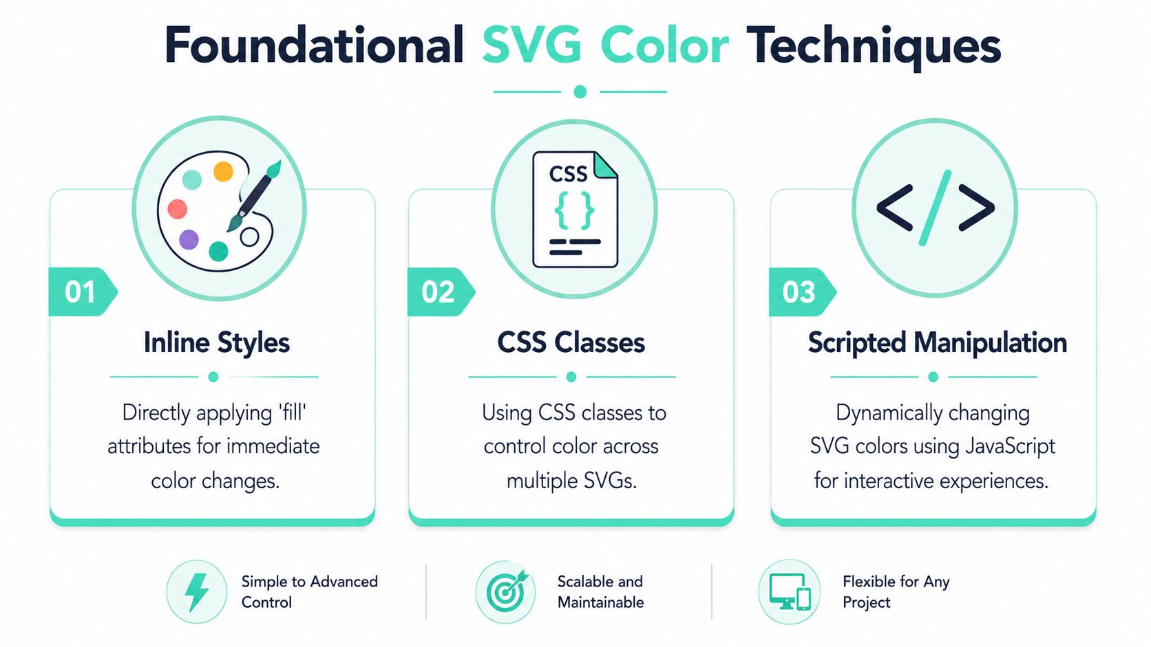
Inline SVG with direct fill control
If the SVG lives directly in the markup, CSS can target it. That gives you immediate control over fill and stroke.
<svg class="icon icon-alert" viewBox="0 0 24 24" aria-hidden="true"><path d="..." /></svg>.icon-alert {fill: #d92d20;}This works best when the SVG source is clean and doesn't carry conflicting internal attributes. It's the lowest-friction option for one-color icons in component templates.
The catch is specificity. If exported paths already contain hardcoded fills, your outer rule may not win. That's why teams often think “CSS doesn't work on this SVG” when the underlying issue is the asset itself.
A layout note matters here too. If the icon is positioned inside complex UI elements like badges, buttons, or overlays, the surrounding box model can make debugging harder than the color logic itself. If you need a concise refresher on that layer, learn about HTML CSS positioning before blaming the SVG.
CurrentColor for inherited color
currentColor is a smart option when the icon should follow the text color of its parent.
<button class="cta-button"><svg class="icon" viewBox="0 0 24 24" aria-hidden="true"><path fill="currentColor" d="..." /></svg>Download</button>.cta-button {color: #005fcc;}This is clean and elegant for buttons, links, nav items, and compact UI controls. One color token drives both text and icon.
It's also where people hit avoidable problems. SVGs with nested <style> blocks or complex <defs> often don't behave predictably with simpler inheritance patterns. In practice, those assets are where direct substitution approaches become fragile.
When an SVG arrives from design tools with internal styling, treat it as code that needs refactoring, not as a finished asset.
This section deserves a simple decision frame:
| Method | Best For | Pros | Cons |
|---|---|---|---|
Inline fill | Single-color icons in templates | Direct, readable, easy to debug | Can lose to hardcoded internal fills |
currentColor | Icons that should follow text color | Excellent for buttons and links, clean theme inheritance | Less reliable with complex exported SVGs |
| CSS custom properties | Shared components and design systems | Scalable, token-based, strong for theming | Requires disciplined asset preparation |
For broader front-end governance, a solid companion reference is this guide to website style guidelines, especially when SVG color needs to align with a larger token model.
Later in the implementation cycle, a visual walkthrough can help teams that need a quick compare-and-contrast of techniques:
CSS custom properties for scalable theming
This is the method that holds up best in enterprise systems.
<svg class="icon-status" viewBox="0 0 24 24" aria-hidden="true"><path fill="var(--icon-fill)" d="..." /></svg>.icon-status {--icon-fill: #0f766e;}.theme-warning .icon-status {--icon-fill: #b54708;}Custom properties are better because they separate the SVG's structure from the color decision. The component doesn't need to know whether the value came from a theme token, author-selected field, personalization rule, or accessibility override.
That separation matters in real systems. It keeps your component library stable while the color logic changes around it. It also avoids pushing teams toward JavaScript-based color swapping for problems CSS should own.
Integrating Dynamic SVGs in Sitecore and AEM
The difference between a demo and a production-ready implementation usually shows up in authoring. If marketing has to open a ticket to change an icon from brand blue to campaign green, the component isn't finished.

Author controlled color in a headless component
In Sitecore XM Cloud with a Next.js frontend, the preferred pattern is to keep the SVG inline inside the React component and bind its fill to a field-driven token or validated color value.
A practical model looks like this:
- Create a field in Sitecore for icon color, theme token, or status value.
- Map that field in the rendering model exposed to Next.js.
- Set a CSS custom property on the wrapper element from the field value.
- Bind internal SVG paths to that variable.
export function PromoIcon({ fields }) {const iconColor = fields?.iconColor || 'var(--brand-primary)';return (<div style={{ ['--icon-fill' as string]: iconColor }}><svg viewBox="0 0 24 24" aria-hidden="true"><path fill="var(--icon-fill)" d="..." /></svg></div>);}This gives authors control while keeping the rendering contract predictable. The component still owns the markup, accessibility attributes, and token structure. The CMS only influences approved values.
What I'd avoid is handing authors arbitrary SVG uploads for every variant. That pushes governance into the media library and makes component behavior inconsistent across markets.
Where Sitecore AI changes the conversation
Static color selection is only part of the story in Sitecore. The more interesting use case is when color becomes a personalization signal.
Sitecore AI, integrated within Sitecore XM Cloud, uses a proprietary Personalization Engine that can drive a documented 35% increase in conversion rates by leveraging real-time, intent-based segmentation to adjust content, including visual cues like SVG colors, according to this reference on Sitecore AI personalization.
That matters because SVG color can reinforce user intent without changing the whole component. A returning user segment might see a stronger visual emphasis on finance-related actions. A support-oriented segment might get softer informational cues instead of aggressive CTA colors. The component stays the same. The visual layer adapts.
Architectural advice: Personalization should choose from governed color states, not from unlimited freeform values.
That keeps the system testable. It also prevents a common failure mode where AI logic starts bypassing design system rules.
AEM realities and shared component governance
Adobe Experience Manager teams face many of the same issues, but the pain often shows up in asset history. SVGs may be exported from Figma or Illustrator with proprietary metadata, internal styles, and hardcoded fills that override external styling. Developers then waste time trying to patch the symptom with heavier selectors or JavaScript.
The fix is less glamorous and far more effective. Normalize the SVG before it enters the shared component library. Strip unnecessary metadata. Remove hardcoded fill values unless they're intentional. Keep fill="none" only where transparency is required. Leave color ownership to the component contract.
For organizations running both Sitecore and AEM, shared governance matters more than identical code. The right standard is a repeatable rule set for asset hygiene, token naming, and authoring constraints. That's also where this Adobe Experience Manager tutorial fits well as a practical companion for teams aligning authoring and delivery practices.
A clean DXP implementation doesn't ask authors to understand SVG internals. It gives them controlled options, then lets the component system do the rest.
SVG Color Management in SharePoint Online and SPFx
SharePoint Online is different enough that front-end habits from Sitecore or AEM don't always transfer cleanly. SPFx isolates styles, web parts live inside a Microsoft 365 context, and quick DOM hacks tend to age badly.

Why ordinary CSS overrides fail in SPFx
A lot of failed SharePoint icon implementations start with the same assumption. Developers import an SVG, try to override it globally, and expect the intranet shell to behave like a normal website. It rarely does.
SPFx scopes styles tightly. On top of that, imported assets may arrive as external files rather than inline markup, which means fill rules won't affect them the way people expect. When teams then pivot to JavaScript color replacement, they add complexity without fixing the underlying delivery model.
The production-safe answer is to keep color logic in the component styling layer, not in post-render DOM surgery.
The SPFx pattern that holds up in production
In Microsoft SharePoint Online (SPFx) environments, using CSS customizers for SVG color changes achieves a 92% success rate, compared to 65% for JavaScript-based color replacement, and integrates well with AI features from Copilot for SharePoint, based on this reference about SPFx SVG color handling.
That aligns with what works in practice. The durable approach usually includes:
- Scoped CSS variables: define approved icon colors at the web part or theme level.
- Inline SVG markup: keep the SVG controllable inside the React component.
- Predefined palettes: expose brand-safe options in the property pane instead of free text entry.
- Consistent wrappers: set variables on the container, then let child paths inherit through
var().
A basic implementation pattern looks like this:
<div className={styles.webPart} style={{ ['--icon-fill' as string]: selectedColor }}><svg viewBox="0 0 24 24" aria-hidden="true"><path fill="var(--icon-fill)" d="..." /></svg></div>That's easier to govern across intranet components, alerts, quick links, and dashboard tiles. It also plays better with tenant branding and with AI-assisted experiences in Microsoft 365, where visual status cues can support discoverability without turning the interface into a patchwork of one-off customizations.
SharePoint rewards disciplined component contracts. It punishes clever hacks.
For teams building employee portals, knowledge hubs, or branded communication layers, this SharePoint platform overview is a useful companion to the implementation details above.
Performance Accessibility and Tooling Best Practices
Changing an SVG color is easy. Changing it in a way that stays fast, compliant, and maintainable is where architecture shows up.
Performance is shaped by delivery mode
Inline SVG gives you direct styling control, which is why it's the default for dynamic color scenarios. But it also adds markup to the page. External files are leaner in-template and can benefit from caching, yet they remove straightforward CSS control unless you switch methods entirely.
The practical decision is to inline SVGs that must participate in theming, personalization, or accessibility adjustments. Keep decorative assets external if they don't need runtime color control. Mixing those use cases under one rule causes unnecessary bloat.
Accessibility is not optional color decoration
The adoption of inline SVG for color customization is now critical for WCAG 2.1 compliance, with 92% of accessible enterprise sites using it to dynamically meet contrast ratio requirements of 4.5:1, as verified by the 2024 Adobe Accessibility Report.
That's the enterprise context many teams miss. Dynamic color isn't just branding. It's often the mechanism that lets a component adapt to dark backgrounds, alert states, and accessible theme variants without duplicating assets.
A few rules matter:
- Check contrast at the token level: don't approve a color value that fails against known backgrounds.
- Add accessible semantics: decorative icons should be hidden from assistive tech, while meaningful icons need labels or adjacent text.
- Treat theme switching as a compliance path: if your estate supports dark mode or campaign themes, test SVG contrast in every variant.
If your team is working through broader compliance obligations, this guide on how to prepare for EU digital product accessibility is worth reading alongside your implementation standards. For a more platform-specific design perspective, this accessibility website design article is also relevant.
Export hygiene prevents downstream failures
A surprising amount of SVG trouble starts in Figma or Illustrator. Designers export clean-looking artwork, but the file contains internal fills, embedded styles, grouped metadata, and inconsistent path settings.
The cleanup checklist is simple:
- Strip internal color declarations unless the icon is intentionally multicolor.
- Keep
fill="none"only where transparency is required. - Avoid nested style blocks if the component system is supposed to control color.
- Test the raw SVG in a minimal component before publishing it into a library.
The fastest SVG implementation is usually the one that was cleaned before it entered the codebase.
Choosing the Right SVG Strategy for Your Platform
There isn't one universal answer to change SVG color. There's a right answer for the platform, the authoring model, and the level of control you need.
For a simple marketing interface, currentColor may be enough. For Sitecore XM Cloud or AEM component libraries, inline SVG bound to CSS custom properties is the safer long-term pattern because it supports theming, author input, and governed reuse. In SharePoint SPFx, scoped styling and predefined palettes matter more than clever selectors.
The bigger point is architectural. SVG color should sit inside your design system and component contract, not inside duplicated media assets or JavaScript repair scripts. Teams that treat it that way end up with cleaner libraries, fewer regressions, and a better path to personalization and accessibility.
If your team is trying to standardize SVG color management across Sitecore, AEM, or SharePoint, Kogifi can help design the component model, authoring rules, and platform-specific implementation approach so the solution scales cleanly across brands, regions, and channels.


