


A DXP project usually starts with confidence and ends with friction when teams skip the discipline of visual alignment. Marketing approves a vision. IT scopes a platform. Agency and internal teams discuss personalization, multisite governance, content migration, and launch phases. Then the first build review happens, and everyone realizes they were agreeing to different things.
That gap is where mockups and wireframes earn their value. On Sitecore and SharePoint projects, they aren't decorative deliverables. They are the control points that keep architecture, design, authoring, and development moving in the same direction before expensive assumptions get locked into code.
Table of Contents
- Start with structure tied to content operations
- Use mockups where they reduce delivery risk
- Design variants as first-class deliverables
- Convert approvals into build-ready component definitions
- Accessibility starts in wireframes
- Localization breaks weak layouts
- What to review before design approval
- Create a governed design package
- Review gates that catch problems early
- Test the right artifact for the right question
Avoiding Costly Rework in DXP Projects
The most expensive rework in enterprise digital delivery rarely comes from bad coding. It comes from bad alignment. A stakeholder says "global landing page" and imagines a campaign experience with flexible modules, segment-specific messaging, and analytics hooks. A developer hears "template." A content team expects reusable authoring blocks. A brand team expects pixel-accurate presentation. All four groups can leave the same workshop thinking they agree.
That mismatch gets painful on Sitecore and SharePoint because both platforms sit inside larger operating models. You're not only building pages. You're defining component libraries, content types, editorial workflows, permissions, integrations, search behavior, localization patterns, and governance rules.
What usually goes wrong
Three patterns show up again and again:
- Structure is implied, not defined: Teams jump into visual design before agreeing on page anatomy, content priority, and user flow.
- Stakeholder feedback arrives too late: Brand, legal, regional marketing, and platform owners review working builds instead of reviewing intent earlier.
- Developers receive pages instead of systems: The handoff contains polished screens, but no clear mapping to reusable components or authoring behavior.
When that happens, revision cycles spread across multiple workstreams. Front-end teams refactor. Content authors ask for fields that don't exist. Sitecore rendering variants need to be revisited. SharePoint web part choices no longer fit the intended layout.
Practical rule: If the first real conversation about layout happens in a sprint review, the project is already carrying avoidable risk.
Wireframes and mockups solve different parts of that problem. Wireframes reduce ambiguity around structure and flow. Mockups reduce ambiguity around presentation and brand expression. Used together, they create a sequence of decisions that enterprise teams can approve in the right order.
That sequence matters because DXP programs involve too many dependencies to leave interpretation open. The earlier teams separate structural decisions from visual ones, the easier it is to protect budget, preserve delivery momentum, and keep the final platform usable for both visitors and content authors.
The Blueprint and The Portrait Defining Wireframes and Mockups
A wireframe is the blueprint. A mockup is the portrait.
That analogy works because these artifacts answer different questions. The blueprint tells you where walls, rooms, and entrances go. The portrait shows what the finished place will feel like when materials, colors, and styling are applied. In digital projects, modern UX references consistently describe wireframes as simple black-and-white or grayscale planning tools used before visual styling, while mockups are later high-fidelity representations of the finished look. That distinction remains standard practice in product development, especially when teams need to align structure before investing in polished visuals, as outlined in Figma's explanation of wireframes vs. mockups.
For enterprise delivery, that distinction isn't academic. Wireframes define page structure, content hierarchy, and user flow. Mockups validate branding, typography, color, and interface aesthetics before development begins. If those jobs get mixed together, feedback quality drops. People start debating color before they've agreed on task flow, or approving layout patterns that won't support real content.
Why enterprise teams need both
Wireframes are deliberately sparse. That sparseness is useful because it keeps meetings focused on what matters early:
- what content appears first
- how users move between tasks
- which elements are reusable
- where forms, search, navigation, and calls to action sit
- what an editor needs to control
Mockups add realism when structure is settled. They help teams answer a different set of questions:
- does the design fit the brand system
- are typography and spacing working at enterprise scale
- will dense content still read clearly
- do components feel consistent across templates and regions
- can stakeholders approve the visual direction before build
For a practical design workflow, Kogifi's guidance on how to design user interfaces aligns well with this progression from structural planning into more refined, interactive design outputs.
Wireframe vs. Mockup At a Glance
| Criterion | Wireframe (The Blueprint) | Mockup (The Portrait) |
|---|---|---|
| Primary purpose | Define structure and flow | Validate visual design |
| Fidelity | Low fidelity | High fidelity |
| Visual style | Usually grayscale or minimal | Branded, polished, detailed |
| Main discussion | Hierarchy, layout, journeys | Typography, color, spacing, UI aesthetics |
| Best stage | Early planning and architecture | Design approval before development |
| Main audience | UX, solution architects, product owners, developers, content strategists | Brand, marketing, stakeholders, front-end developers |
| Enterprise value | Prevents structural confusion | Prevents visual and branding rework |
| Common mistake | Treating it as too rough to matter | Treating it as production-ready behavior |
What each artifact should include
A good wireframe for a Sitecore or SharePoint program should show enough detail to support implementation decisions without drifting into visual polish. That often includes labels for global navigation, hero structure, component order, content zones, author-controlled fields, and variant logic.
A good mockup should do more than look attractive. It should express the design system in a way developers can implement repeatedly. That means real component states, real spacing logic, responsive intent, and examples that reflect content-heavy enterprise realities rather than idealized marketing copy.
A mockup that can't be translated into a reusable component library is just a nice picture.
Strategic Roles in the DXP Implementation Lifecycle
The best use of mockups and wireframes isn't linear for the sake of process. It's staged to reduce risk at the right moments in delivery.
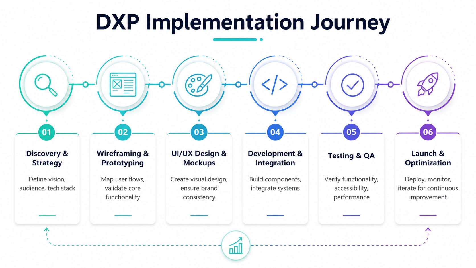
On large Sitecore and SharePoint programs, each artifact supports a different approval layer. Wireframes belong where teams are still shaping information architecture and content logic. Mockups belong where teams need visual commitment without prematurely discussing interactivity or engineering detail.
Where wireframes belong
Wireframes are strongest during discovery, content strategy, and solution architecture, as teams decide what the platform must support before they debate what it should look like.
In Sitecore projects, wireframes are particularly valuable when defining:
- Component inventory: Hero, card grid, promo banner, article body, CTA strip, related content, search results, and campaign modules.
- Content relationships: Shared content versus local content, taxonomy-driven listings, campaign pages versus evergreen templates.
- Authoring behavior: Which fields editors manage, which layout options they can select, and where guardrails are needed.
- Journey logic: Entry pages, conversion paths, gated content, and regional or segment-specific branches.
ProductPlan describes wireframes as low-fidelity representations that map layout and structure, and notes a workflow in which early wireframing clarifies decisions before build. The same source cites an industry claim that wireframing can reduce development bugs by up to 40%, because teams think through user flow before development starts, as discussed in ProductPlan's comparison of wireframes, mockups, and prototypes.
Where mockups belong
Mockups become useful once the structural argument is mostly settled. At that point, they help stakeholders approve the visual expression of the system.
That includes:
- Brand consistency: Typography scale, visual density, icon treatment, image ratio, and CTA styling.
- Component states: Hover, active, error, empty, selected, and promotional variants.
- Template realism: Product detail pages, newsroom layouts, resource centers, and campaign landing pages with actual content pressures.
- Executive review: Showing leadership what the future platform will look like without presenting unfinished software as if it's final.
Static mockups remain useful because they create a controlled review environment. Stakeholders can sign off on look and feel without getting distracted by prototype mechanics or incomplete back-end behavior.
What this looks like on Sitecore and SharePoint programs
Sitecore and SharePoint have different implementation constraints, so the artifacts need different emphasis.
For Sitecore XM Cloud, wireframes should closely reflect component-driven delivery. That means avoiding one-off page compositions unless the business has approved them as exceptions. A page should read like an arrangement of reusable renderings, not a custom artwork. Mockups should then show how those renderings behave across page types, brands, and personalization variants.
For Sitecore Content Hub, wireframes should account for asset sourcing, content reuse, and editorial operations. If a page pattern depends on structured assets, legal approvals, or campaign metadata, that dependency needs to be visible early.
For SharePoint Online and SPFx-based solutions, wireframes should test what belongs in standard page templates, what needs custom web parts, and what should remain within the platform's native publishing patterns. Mockups should stay realistic about those implementation choices. Designing a visual pattern that ignores SharePoint page regions or governance constraints only shifts the problem downstream.
Teams save time when they approve the system in layers. First structure. Then presentation. Then behavior.
A Modern Workflow for Sitecore DXP Projects
A familiar enterprise pattern goes wrong fast. Marketing approves polished screens, developers start building in XM Cloud, and only then does the team discover that the design assumes components, content relationships, or personalization rules the platform was never scoped to support. The rework is expensive because the problem started too late in the process.
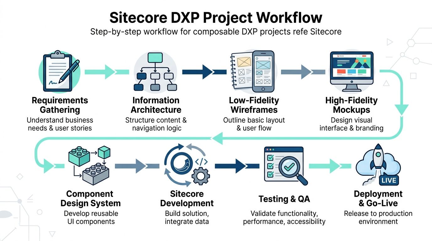
A better workflow is iterative and component-led. Teams move from low-fidelity structure into approved component patterns, then raise fidelity only where visual precision, stakeholder approval, or interaction risk justifies the extra effort. That matters on Sitecore programs because XM Cloud, Content Hub, Sitecore Search, and personalization all depend on structured decisions made early.
Start with structure tied to content operations
On Sitecore projects, the first design pass should connect page intent, component inventory, and content model. A homepage wireframe without template logic is incomplete. It may look useful in a workshop, but it does not give architects or developers enough to validate the solution.
The early artifact should answer practical questions such as:
- which modules can be reused across markets, brands, or business units
- which modules need datasource items or shared content sources
- which fields belong in templates and which belong in presentation parameters
- which variants need personalization rules or experimentation support
- which content comes from integrated systems, Content Hub, or manual authoring
- which patterns are global standards and which are campaign exceptions
I have found this stage works best when UX, content, and solution architecture review the same working file. Figma can handle that well, especially when teams pair layout exploration with a documented website style guideline framework that keeps visual decisions tied to reusable standards rather than one-off pages.
Use mockups where they reduce delivery risk
The old sequence of wireframe, mockup, then prototype still has value. It just should not be applied mechanically.
Modern teams can generate polished concepts quickly with AI-assisted design tools and Sitecore AI supported workflows. Speed helps during exploration, but it also creates a common failure mode. Visual options appear finished before the team has agreed on content structure, authoring constraints, or variant logic. AI can draft interface directions and content ideas. It cannot resolve whether a component fits your XM Cloud architecture or whether editors can realistically manage it.
Mockups still earn their place when the team needs to settle issues like these:
- executive approval for a new visual direction
- tightly governed brand experiences
- content-heavy templates with multiple states
- global component patterns inherited by many markets
- personalized experiences that need review before development starts
Reduce the mockup stage when the design system is mature, the component already exists, and the main open question is task flow or business logic. In those cases, a clickable prototype or annotated wireframe often gives the team enough confidence to proceed.
A short product overview can help teams visualize how Sitecore fits into modern composable delivery:
Design variants as first-class deliverables
On Sitecore, one page template rarely maps to one final experience. XM Cloud pages often support audience-specific messaging, optional modules, campaign-driven content mixes, and localized versions with different content lengths. If design files show only one polished version, developers are left to fill in the gaps, and those assumptions usually surface later as defects or change requests.
Mockups should show the range the component must support.
| Design need | What to show in mockups |
|---|---|
| Personalization | Default experience plus selected audience variants |
| Content density | Short, medium, and content-heavy examples |
| Editorial flexibility | Optional modules present and absent |
| Responsive intent | Mobile-first behavior for complex components |
| Localization readiness | Longer labels and alternate CTA lengths |
This is especially important for Sitecore Search, Content Hub, and personalization workstreams, where the final experience depends on data, reusable assets, and rules rather than one perfect static page.
Convert approvals into build-ready component definitions
Once the team approves the component set and its variants, the work shifts from design approval to implementation clarity. Every approved pattern should become a component definition that development can estimate, build, and test without interpretation gaps.
In practice, the workflow often looks like this:
- Define business outcomes and priority journeys in workshops.
- Map content types, authoring needs, and integration dependencies before visual design.
- Create low-fidelity wireframes for high-risk templates and shared modules.
- Review with architects, developers, and content owners to confirm Sitecore fit.
- Produce high-fidelity mockups for items that need visual approval or variant review.
- Add prototypes where interaction flow, form behavior, or decision logic needs validation.
- Translate approved patterns into component definitions and backlog items.
- Build in XM Cloud and connected Sitecore products against that approved system.
At this stage, a delivery partner can support alignment across UX, architecture, implementation, and managed platform operations when the internal team does not cover all of those roles.
Handoff Best Practices for Sitecore and SharePoint Teams
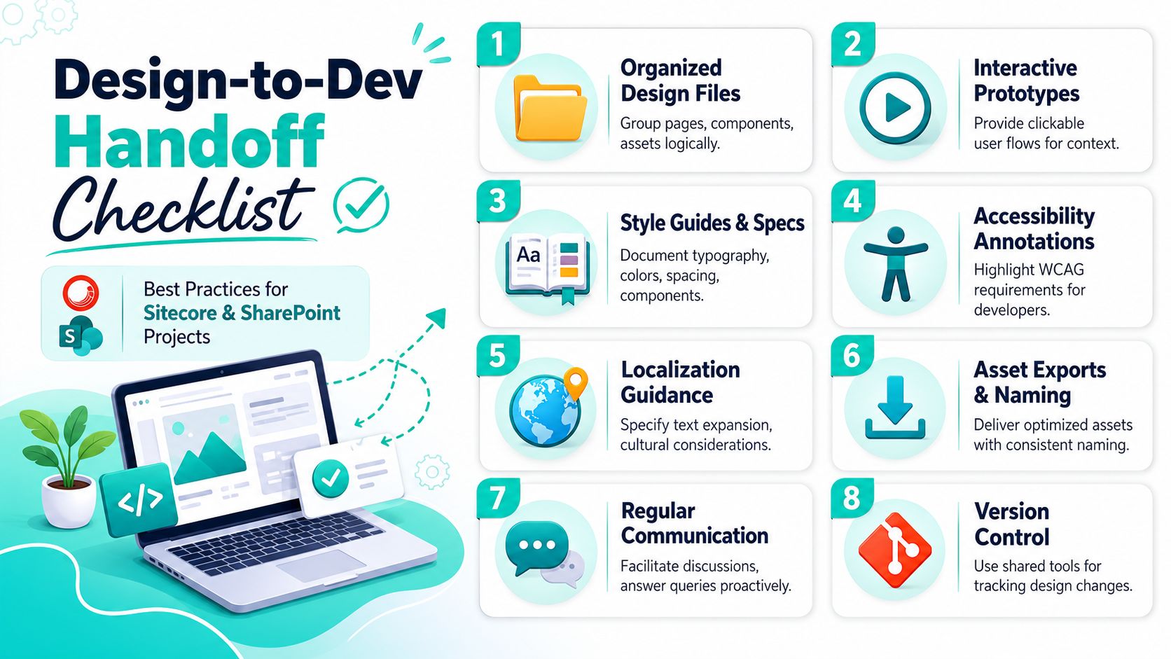
Many design handoffs fail because they stop at surface detail. Developers receive artboards, fonts, and asset exports, but no implementation logic. On enterprise CMS programs, that isn't enough. Sitecore and SharePoint teams need designs translated into components, fields, rules, and constraints.
What developers need from designers
For Sitecore teams, every approved design should answer these practical questions:
- Is this a new component or a variation of an existing one?
- Which content fields are required?
- Which fields should editors be allowed to change?
- Is this layout fixed, configurable, or conditional?
- Does the component support personalization or experimentation?
- What are the empty, fallback, and error states?
For SharePoint teams, the handoff should also clarify platform fit:
- can this be achieved with standard page sections and native web parts
- does it require SPFx customization
- are there tenant or governance constraints that limit implementation
- how will the component behave within SharePoint's layout system
- what content will site owners manage directly
A good style foundation makes this much easier. Kogifi's article on website style guidelines is a useful reference for documenting tokens, patterns, and consistency rules before development starts.
A practical handoff checklist
Use this checklist before handing mockups to development:
- Map every screen to a component model: Replace labels like "homepage banner final v3" with implementation-friendly names such as Hero, Promo Card Grid, Featured Article Rail, or Two-Column CTA.
- Document authoring fields: List heading, eyebrow, body, CTA label, CTA URL, image, background theme, alignment option, and any validation rules.
- Show responsive intent clearly: Don't leave mobile behavior to interpretation. Include stacking order, truncation rules, and spacing changes.
- Annotate interactions: If a dropdown opens, a tab changes content, or a card expands, record expected behavior even if the mockup is static.
- Specify reusable tokens: Typography scale, spacing units, colors, border radius, shadows, and breakpoints should map to a shared design system.
- Include content examples with real pressure: Use realistic headlines, long link labels, legal copy, metadata, and card collections. Placeholder text hides layout problems.
- Mark accessibility requirements: Focus states, keyboard order, semantic headings, error messaging, and contrast expectations should be visible in the handoff package.
- Version the design package: Developers need one approved source of truth. Archive older variants and mark superseded frames clearly.
The fastest handoff isn't the one with the fewest files. It's the one with the fewest assumptions left for developers to resolve.
For component-based Sitecore builds, I also recommend adding a simple matrix that maps each approved component to template fields, personalization readiness, analytics relevance, and test cases. That matrix becomes useful later during QA and author training.
Designing for All Accessibility and Localization
Accessibility and localization aren't cleanup tasks. They change layout, navigation, content structure, and component behavior. If teams wait until QA to address them, the design system is already carrying avoidable defects.

Accessibility starts in wireframes
Wireframes should already reflect accessibility thinking. That means planning for heading order, navigation landmarks, focus sequence, form structure, and task completion without relying on visual cues alone.
On Sitecore and SharePoint programs, this matters because accessibility issues often originate in templates and shared components. If a page pattern starts with unclear hierarchy or weak task flow, every instance of that pattern repeats the problem.
Design teams should account for:
- Logical reading order: Especially for card layouts, multi-column regions, and promotional bands.
- Navigation predictability: Global nav, breadcrumbs, in-page links, and footer structures should support orientation.
- Form clarity: Labels, help text, validation messages, and error recovery need a place in the layout early.
- Non-visual understanding: Icons and badges should never carry meaning alone.
For a deeper operational view, Kogifi's guidance on accessibility in website design is relevant for teams building inclusive enterprise experiences.
Localization breaks weak layouts
Localization exposes fragile design decisions quickly. A CTA that fits neatly in English may wrap awkwardly in German. A compact card title may expand across lines. Right-to-left considerations may affect icon direction, alignment, and visual hierarchy.
This isn't only a translation concern. It's a component design concern.
Mockups should include examples that test:
| Risk area | What to review |
|---|---|
| Buttons and CTAs | Longer translated labels |
| Navigation | Expanded menu items and utility links |
| Cards and promos | Variable title and summary lengths |
| Forms | Region-specific labels and instructions |
| Metadata | Date, time, and content labeling differences |
What to review before design approval
Before a design package moves into development, teams should ask direct questions.
- Can keyboard users complete primary tasks?
- Will longer text break this module?
- Does color reinforce meaning, or carry it alone?
- Can authors localize this content without redesigning the layout?
- Are empty or partial content states still understandable?
Accessibility and localization aren't edge cases on global DXP platforms. They are normal operating conditions.
That is especially true for public sector, education, healthcare, and multinational brand environments where Sitecore multisite and multilingual capabilities are part of the platform strategy from day one.
Governance Prototyping and Testing Strategies
Without governance, mockups and wireframes become a pile of disconnected files. One team names components one way, another team uses different spacing rules, and a third team designs page types that don't fit the shared architecture. Enterprise delivery needs a controlled design process, not just talented designers.
Create a governed design package
A governed package usually starts with standard templates. Teams should have approved formats for sitemap wireframes, template wireframes, component sheets, mockup states, responsive views, and design annotations.
Those templates should define:
- Naming conventions: Component names, page type names, and variant labels that match implementation language.
- Approval states: Draft, in review, approved for design, approved for build, superseded.
- Required annotations: Fields, interactions, accessibility notes, responsive rules, and localization comments.
- Storage rules: A single system of record for files, comments, and version history.
This avoids the common enterprise problem where the visual design is approved, but no one can tell which version developers should implement.
Review gates that catch problems early
A simple review model works well. It doesn't need to be bureaucratic, but it does need discipline.
| Review gate | Main question |
|---|---|
| Discovery review | Are goals, audiences, and platform constraints clear? |
| Wireframe review | Does structure support journeys, content, and authoring? |
| Mockup review | Is the visual system ready for approval and reuse? |
| Build-readiness review | Can development implement this without guessing? |
| Pre-QA review | Are expected states and acceptance criteria documented? |
One useful practice is to separate stakeholder groups by decision type. Business owners approve priorities. Brand teams approve expression. Architects approve feasibility. Editors approve authoring fit. Developers approve implementation clarity. Mixed review groups often generate noisy feedback because each role is evaluating the wrong thing at the wrong fidelity.
Test the right artifact for the right question
Not every design question needs a prototype. Testing should match the uncertainty.
Use wireframes when you're validating structure, labels, navigation, and content sequence. Use mockups or click-through versions of them when people need to judge comprehension, confidence, and visual clarity. Use more interactive prototypes only when behavior itself is the open question.
A practical testing habit is to ask one narrow question per round. Don't try to test hierarchy, trust, findability, motion, and full task completion in one session. Enterprise teams get better decisions when each round has a tight purpose.
For teams formalizing this practice, Kogifi's overview of how to conduct usability testing provides a helpful operational reference for planning sessions and evaluating findings.
Unifying Design and Development for DXP Excellence
Strong DXP programs don't treat design artifacts as paperwork. They use them to control risk, align teams, and convert strategy into buildable systems.
Wireframes give enterprise teams a disciplined way to agree on structure, hierarchy, and flow before development starts. Mockups give them a disciplined way to approve visual direction, component behavior, and brand expression before implementation hardens. On Sitecore projects, that process becomes even more important because the platform supports composable delivery, reusable components, personalization, multilingual content, and AI-assisted workflows that can amplify both good decisions and bad ones.
The key is not producing more artifacts. The key is using the right artifact at the right moment, with the right level of detail, and tying every design decision back to platform reality. That means authoring constraints, component reuse, localization, accessibility, and governance all need to be visible before code begins.
Teams that do this well move faster because they argue earlier, in cheaper formats.
If you're planning a Sitecore or SharePoint initiative and want a cleaner path from design intent to production delivery, talk to Kogifi. A strong implementation starts when wireframes, mockups, architecture, and development are treated as one connected system rather than separate handoffs.