


In the mobile-centric reality we operate in, a responsive website is not just a feature; it's the core foundation of a successful digital experience platform (DXP). For enterprise systems like Sitecore and SharePoint, mastering responsive design is mission-critical for delivering consistent, high-performing user journeys across every conceivable device. Simply shrinking down desktop content is a relic of the past. Modern responsiveness demands a strategic, holistic approach that expertly blends fluid layouts, aggressive performance optimization, and seamless CMS integration. The business case is clear, and to fully grasp the 'why' behind this mindset for your DXP, exploring the undeniable benefits of responsive website design provides essential context for the technical execution that follows.
This article moves beyond theory to provide a definitive guide on the 10 most essential responsive web design best practices, offering deep expertise tailored specifically for complex enterprise-level platforms. We will explore how to leverage the power of Sitecore’s component-based architecture and SharePoint's collaborative frameworks to build truly adaptive, future-proof digital experiences. The following sections provide actionable steps to:
- Implement a mobile-first development philosophy.
- Master flexible grids, media, and typography.
- Optimize performance and touch interactions.
- Develop a robust cross-device testing strategy.
Each practice is designed to help your team create engaging digital properties that not only look great on any screen but also drive measurable business growth and enhance user satisfaction.
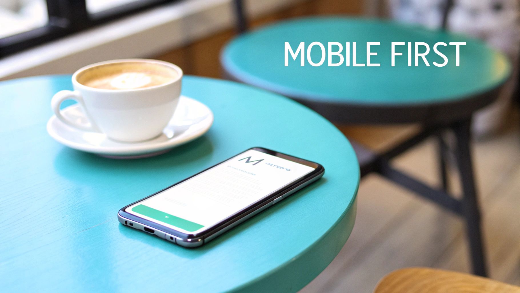
1. Mobile-First Approach in Sitecore and SharePoint
A mobile-first methodology fundamentally flips the traditional design process. Instead of creating a desktop experience and shrinking it down, you start with the smallest screen as your primary design target. This approach forces a focus on core content and functionality, ensuring a lean, fast, and highly usable experience on mobile devices before progressively enhancing it for tablets and desktops. Adopting this practice is crucial for any modern digital strategy, especially within enterprise-level DXPs.
This philosophy aligns directly with Google's mobile-first indexing, which prioritizes the mobile version of a site for ranking and indexing. For platforms like Sitecore and SharePoint, this isn't just a design trend; it's a technical discipline that impacts performance and SEO. To delve deeper into the core philosophy of this strategy, you might find it useful to understand more about what is mobile-first design.
Implementation in Enterprise Platforms
In a Sitecore context, a mobile-first approach means defining mobile-specific renderings and data sources from the beginning. For example, using Sitecore Experience Accelerator (SXA), you can leverage Rendering Variants to create distinct HTML outputs for a single component based on the device. This allows you to serve a simplified, touch-friendly version of a component for mobile users while providing a more complex, feature-rich version for desktop, all from the same content item.
For SharePoint, this involves designing modern web parts and communication sites with a mobile viewport as the initial constraint. The SharePoint Framework (SPFx) provides a mobile preview within the workbench, enabling developers to test and validate component behavior on small screens throughout the development lifecycle.
Actionable Tips
- Design for 320px Baseline: Start your design process with a minimum screen width of 320px to accommodate older, smaller smartphones.
- Utilize Platform Tools: In Sitecore, master SXA’s Rendering Variants. In SharePoint, consistently use the SPFx workbench's mobile preview.
- Optimize Assets: Prioritize lightweight images and minimize HTTP requests specifically for mobile renderings to ensure fast load times.
- Implement Viewport Meta Tag: Ensure
<meta name="viewport" content="width=device-width, initial-scale=1.0">is present in your<head>to control the viewport’s size and scale correctly.
2. Flexible Grid Layouts
A flexible grid layout is the structural backbone of modern responsive design, moving away from rigid, pixel-based dimensions. Instead, it employs relative units like percentages, allowing layout elements to fluidly resize and reflow in proportion to the browser viewport. This ensures that the visual hierarchy, alignment, and spacing remain consistent and aesthetically pleasing across an infinite range of screen sizes, from a small smartphone to a large desktop monitor.

This proportional system is a core tenet of responsive web design best practices, providing a predictable and scalable foundation. For enterprise platforms managing vast amounts of content, a reliable grid is not just a design choice but a requirement for content authoring efficiency and brand consistency. For a deeper dive into practical application on a major DXP, you can learn how to build responsive layouts with AEM.
Implementation in Enterprise Platforms
Within Sitecore Experience Accelerator (SXA), the grid system is a first-class citizen. SXA comes with a built-in, responsive grid based on technologies like Bootstrap or Foundation, enabling content authors to control layout directly within the Experience Editor. They can easily assign column widths to components for different devices (e.g., a component can span 12 columns on mobile but only 4 on desktop) without writing any code, ensuring both flexibility and governance.
In SharePoint, Modern sites and pages are built on a responsive grid out of the box. When using the SharePoint Framework (SPFx), developers build web parts that live within this grid. The framework handles the responsive behavior of the overall page structure, allowing developers to focus on making the content within their web parts fluid and adaptive.
Actionable Tips
- Embrace Relative Units: Use percentages for container widths and
emorremfor typography and spacing to ensure scalability. The basic formula for a fluid width is:(target / context) * 100 = result%. - Leverage CSS Grid: For complex layouts, implement CSS Grid. It offers powerful two-dimensional layout control that is ideal for modern, component-based architectures in Sitecore and SharePoint.
- Set Max-Widths: Apply a
max-widthproperty to your main container to prevent the layout from stretching to an unreadable width on very large screens. - Use Platform Grids: In Sitecore, lean heavily on the SXA grid system for author-controlled layouts. For SharePoint, design SPFx web parts to be 100% wide within their container, letting the platform's grid manage the rest.
3. Flexible Images and Media
Flexible images and media are the cornerstone of a truly responsive layout, ensuring that visual content scales fluidly within its container. This practice prevents images, videos, and other media from overflowing their parent elements, breaking the layout, or appearing distorted on different devices. It involves using CSS and HTML techniques to make media intrinsically adapt to the viewport, which is a fundamental aspect of modern responsive web design best practices.
The core principle is to allow an image's size to be relative rather than fixed. Instead of setting a rigid width and height, you define rules that allow it to shrink or grow while maintaining its aspect ratio. This prevents the common problem of large, fixed-width images creating horizontal scrollbars on mobile devices, which severely degrades the user experience and is a critical consideration for enterprise-level platforms managing vast media libraries.
Implementation in Enterprise Platforms
In Sitecore, managing flexible media is streamlined through its Digital Asset Management (DAM) and Media Library capabilities. When an editor uploads an image, Sitecore can automatically generate different sizes or "renditions." Developers can then use the srcset attribute in component renderings to serve the most appropriate image size based on the user's viewport, significantly improving performance. For example, a hero banner component can be configured to pull a large 1920px image for desktop but a smaller, optimized 640px version for mobile, all from a single content item.
For SharePoint modern sites, the platform handles much of this automatically within its native web parts like the Image or Hero web part. When you add an image, SharePoint’s framework ensures it scales correctly within the responsive grid of the page. For custom SPFx solutions, developers must implement CSS rules like max-width: 100% on image elements to ensure custom components remain fluid and integrate seamlessly with the out-of-the-box responsive behavior.
Actionable Tips
- Use Foundational CSS: Apply
img, video, iframe { max-width: 100%; height: auto; }as a baseline in your global stylesheet to make most embedded media responsive by default. - Implement
srcsetfor Resolution Switching: Use thesrcsetattribute on<img>tags to provide multiple image sources, allowing the browser to select the best one based on screen resolution and size, a key practice for performance. - Leverage Modern Formats: In Sitecore, configure media handlers to support modern formats like WebP, which offer superior compression. Provide fallbacks to JPEG or PNG for older browsers using the
<picture>element. - Optimize Within the DXP: Use Sitecore’s image optimization features or integrate third-party services to compress images upon upload, reducing file sizes without sacrificing quality.
4. CSS Media Queries and Breakpoints
CSS media queries are the foundational rules that enable responsive web design, allowing you to apply different styles based on device characteristics like screen width, height, and orientation. Breakpoints are the specific points at which your layout adapts, ensuring content is optimized for various device categories, from small phones to large desktops. This technique is a cornerstone of modern frontend development and one of the most critical responsive web design best practices.
This powerful CSS feature lets you conditionally apply styles, meaning you can change a layout from a single column to a multi-column grid as the screen size increases. The effectiveness of this approach is a core part of the Sitecore Experience Accelerator's design, which provides a standardized breakpoint system to accelerate responsive development.
Implementation in Enterprise Platforms
Within Sitecore Experience Accelerator (SXA), breakpoints are a core concept. The grid system is built around a set of predefined breakpoints that control how components and columns reflow across different devices. Developers can customize these breakpoints in the site settings to match specific design requirements, ensuring that Sitecore’s presentation layer aligns perfectly with the frontend styling rules. This tight integration allows content authors to preview how pages will look on different devices directly within the Experience Editor.
For SharePoint, modern sites and the SharePoint Framework (SPFx) are inherently responsive. However, custom web parts often require their own media queries to handle complex layouts. By writing mobile-first media queries using a min-width approach, you ensure that custom SPFx components render correctly on mobile devices first, then progressively enhance for larger screens, aligning with SharePoint’s own responsive behavior.
Actionable Tips
- Use Logical Breakpoints: Start with a standard set like 320px (small mobile), 768px (tablet), 1024px (small desktop), and 1440px (large desktop), but adjust based on your content and design needs.
- Write Mobile-First Queries: Structure your CSS with a mobile-first approach using
min-widthqueries. This makes your code cleaner and aligns with performance best practices. - Keep Queries Close to Code: Place your media queries directly next to the CSS rules they modify, rather than in a separate stylesheet. This improves code maintainability.
- Avoid Device-Specific Breakpoints: Design for content, not for specific devices. Let your content dictate where breakpoints are needed to prevent the layout from "breaking."
5. Viewport Meta Tag Configuration
The viewport meta tag is the crucial first line of code that signals to a browser how a web page should be scaled and displayed on mobile devices. Without this simple HTML tag, mobile browsers will often render the page at a desktop screen width and then shrink it down, resulting in unreadable text and a poor user experience. Proper configuration is a foundational requirement for any responsive design to function as intended, making it one of the most critical responsive web design best practices.
This tag instructs the browser to set the viewport width to the device's actual screen width and establish an initial zoom level. It is the cornerstone that allows CSS media queries to work correctly, enabling the layout to adapt to different screen sizes. For enterprise platforms like Sitecore and SharePoint, ensuring this tag is present and correctly configured in all page layouts and master pages is a non-negotiable step.
Implementation in Enterprise Platforms
In Sitecore, the viewport meta tag is typically placed within the main layout file (.cshtml) of your solution, often in a shared <head> section managed by your base page template. For sites built with Sitecore Experience Accelerator (SXA), this is managed out-of-the-box in the default themes and page layouts, ensuring consistent behavior across all pages. Verifying its presence in your Page Designs is a key quality assurance check during development.
Similarly, in SharePoint Online modern experiences, the framework automatically handles the inclusion of the correct viewport meta tag. For classic SharePoint sites or custom master pages, it's the developer's responsibility to add <meta name="viewport" content="width=device-width, initial-scale=1.0"> to the <head> section of the master page to enable responsive behavior for custom web parts and page layouts.
Actionable Tips
- Use the Standard Declaration: Always start with
<meta name="viewport" content="width=device-width, initial-scale=1.0">. This is the universally accepted standard. - Avoid Disabling User Zoom: Never use
user-scalable=no. This is a major accessibility issue as it prevents users with low vision from zooming in on content. - Support Notches and Cutouts: Add
viewport-fit=coverto your content attribute to ensure your layout fills the entire screen on devices with notches (like modern iPhones), preventing white bars. - Test with Emulation: Use browser developer tools, like Chrome DevTools' device emulation, to quickly verify how different devices interpret your viewport settings.
6. Fluid Typography and Modular Scales
Fluid typography moves beyond fixed pixel values, utilizing relative units like rem, em, and viewport units (vw) to allow text to scale smoothly with the viewport. This approach is paired with a modular scale, a predefined set of harmonious proportions (e.g., 1.25, 1.618) used to determine font sizes for headings and paragraphs. This combination ensures that the visual hierarchy and readability are maintained across all devices, from a small mobile screen to a large desktop monitor, creating a more cohesive and accessible user experience.
This technique is a cornerstone of modern responsive web design best practices, as it prevents awkward text wrapping and sizing issues that can occur with static, breakpoint-based font adjustments. By making typography inherently responsive, you create a more elegant and adaptable design that feels tailored to any screen size.
Implementation in Enterprise Platforms
In enterprise platforms like Sitecore, fluid typography can be systemized using design tokens within a headless architecture. When using front-end frameworks like Next.js with Sitecore JSS, you can define your modular scale and fluid type rules as design tokens. These tokens are then referenced in your component styles, ensuring brand consistency and making global typographic changes simple to manage. This approach avoids hardcoding values directly in component stylesheets.
For SharePoint modern sites, you can inject custom CSS using SPFx Application Customizers to override default styles and implement a fluid typographic scale. By setting a base font size on the root element and using relative units for web parts and text elements, you ensure that content entered by editors scales predictably and maintains its intended hierarchy within the SharePoint environment.
Actionable Tips
- Establish a Root Size: Set your root font-size to 62.5% in your global CSS. This makes 1rem equal to 10px, simplifying
remcalculations. - Use
remandemStrategically: Useremfor global elements like base font size and spacing to maintain overall scale. Useemfor component-specific elements where sizing should be relative to the component's font size, not the root. - Implement
clamp()for Smooth Scaling: Use the CSSclamp()function to set a minimum font size, a preferred scalable size based on viewport width, and a maximum size. For example:font-size: clamp(1rem, 2.5vw, 1.5rem);. - Choose a Modular Scale: Select a ratio that fits your design aesthetic (e.g., 1.2 for a subtle scale, 1.618 for high contrast) and apply it consistently to your heading levels (h1, h2, h3, etc.).
- Test for Accessibility: Ensure your base body text is equivalent to at least 16px. Test the design by zooming the browser to 200% to confirm that text remains readable and does not break the layout.
7. Touch-Friendly Interface Design
A touch-friendly interface goes beyond simply making elements smaller; it requires designing specifically for the nuances of finger-based interaction on screens. Unlike a precise mouse cursor, fingers are imprecise and cover a larger surface area. This principle dictates that interactive elements like buttons, links, and form fields must be large enough to be tapped accurately without accidentally hitting adjacent elements. This is a foundational aspect of modern responsive web design best practices, ensuring usability and preventing user frustration on mobile and tablet devices.

This design consideration is not just about convenience; it's a critical component of digital accessibility. Interfaces that are difficult to use with touch are often inaccessible to users with motor impairments. For enterprise platforms like Sitecore and SharePoint, ensuring every component is touch-friendly is essential for compliance and for delivering a seamless user experience to all audiences. To explore this connection further, it's beneficial to understand more about best practices for accessible website design.
Implementation in Enterprise Platforms
Within Sitecore, this means configuring component styles directly within the theme or using Rendering Variants in SXA to enforce minimum heights and padding for interactive elements. For instance, a button rendering can be styled with CSS to have a min-height and min-width of 44px, ensuring it meets Apple's Human Interface Guidelines for tap targets, regardless of the text it contains. You can also use CSS media queries to disable hover-dependent effects like complex dropdowns, replacing them with touch-friendly accordion or modal behaviors on smaller viewports.
In SharePoint, this principle is applied when creating SPFx web parts. Developers should ensure that all clickable elements within a custom web part, from icons to links, adhere to touch-target size recommendations. The SharePoint mobile app renders these web parts natively, so any failure to create adequate spacing and sizing will result in a poor, unusable experience for on-the-go enterprise users.
Actionable Tips
- Enforce Minimum Target Size: Set a minimum size of 44x44 pixels for all interactive elements to ensure they are easily tappable.
- Provide Ample Spacing: Maintain at least 8px of space between touch targets to prevent accidental taps.
- Handle Hover States Gracefully: Use the
@media (hover: hover)CSS query to apply hover effects only to devices that support them, avoiding broken interactions on touchscreens. - Give Instant Feedback: Implement visual feedback, like a brief color change, when a user taps an element to confirm the action was registered.
8. Performance Optimization and Progressive Enhancement
Performance optimization is the practice of making a website load as quickly as possible, while progressive enhancement is a strategy that starts with a baseline of essential content and functionality for all browsers. More advanced features are then layered on top for browsers that can support them. This dual approach ensures that every user, regardless of their device or connection speed, gets a functional and fast experience, which is a cornerstone of effective responsive web design best practices.
Slow-loading sites frustrate users and are penalized by search engines, making performance a non-negotiable priority. Google's Core Web Vitals (LCP, FCP, CLS) are direct ranking factors that measure user experience. By focusing on performance, you not only improve usability but also enhance SEO and conversion rates. To understand the full scope of this critical discipline, you can explore detailed strategies for how to optimize website performance.
Implementation in Enterprise Platforms
Within Sitecore, performance is managed at multiple levels. Developers can use adaptive image renderings to serve appropriately sized images based on the user's viewport, which significantly reduces payload. Sitecore's integrated caching mechanisms, including HTML output caching and component-level caching, can be configured to minimize server processing time for repeat visits. Furthermore, a CDN like Sitecore Experience Edge for XM can deliver assets and content from a geographically distributed network, dramatically reducing latency for global audiences.
In SharePoint Online, modern sites are already built with performance in mind. However, developers can further optimize by using the Office 365 CDN to host static assets like scripts and images. When developing with SPFx, it's crucial to bundle and minify JavaScript and CSS assets and to be mindful of the number of external API calls made by web parts, as each adds to the overall load time.
Actionable Tips
- Meet Core Web Vitals: Aim for a Largest Contentful Paint (LCP) under 2.5s, a First Contentful Paint (FCP) below 1.8s, and a Cumulative Layout Shift (CLS) of less than 0.1.
- Leverage Platform CDNs: Utilize Sitecore Experience Edge or the Office 365 CDN to serve assets quickly and reduce origin server load.
- Defer Non-Critical Resources: Load non-essential JavaScript and CSS asynchronously or defer their execution to ensure the main content renders without delay.
- Optimize Media: Compress images using modern formats like WebP and implement lazy loading for images and videos that are below the fold.
9. Flexible Navigation Patterns
Navigation is the map to your digital experience, and on a responsive site, that map must change its form to fit the user's context. Flexible navigation patterns involve creating menu systems that adapt intelligently to different screen sizes and interaction models. Instead of a one-size-fits-all header, this practice uses patterns like the hamburger menu, off-canvas navigation, and priority-plus menus to ensure usability and accessibility on any device.
This approach is one of the most critical responsive web design best practices because poor navigation on mobile can lead to immediate user frustration and site abandonment. For enterprise platforms, where information architecture is often complex, an adaptive navigation strategy is essential for guiding users to key content and conversion points, regardless of their entry point.
Implementation in Enterprise Platforms
Within Sitecore Experience Accelerator (SXA), you can implement flexible navigation without custom code by using the Navigation component and its styling options. You can configure different rendering variants or apply specific CSS classes based on Grid System breakpoints to transform a horizontal desktop menu into a collapsible hamburger menu for mobile. For example, a common practice is to use utility classes to hide the main navigation <ul> on mobile and reveal a toggle button that controls its visibility.
In SharePoint, modern communication sites inherently use responsive navigation. The top navigation bar automatically collapses into a "three-dots" menu on smaller screens. Developers using the SharePoint Framework (SPFx) can build custom Application Customizers to create more sophisticated headers, such as an off-canvas navigation drawer that provides a richer, app-like experience for mobile users accessing the intranet on the go.
Actionable Tips
- Prioritize Accessibility: Use semantic HTML (
<nav>,<ul>,<li>) and ARIA attributes likearia-expandedandaria-labelto ensure screen readers can interpret the menu's state and purpose. - Ensure Discoverability: The "hamburger" icon is widely recognized, but it should still be large, have sufficient contrast, and be placed in a conventional location like the top-right or top-left corner.
- Optimize for Touch: Ensure menu toggles and links have a large enough tap target size (at least 48x48 pixels) to prevent accidental taps on mobile devices.
- Use Smooth Transitions: Employ CSS transitions for properties like
transformandopacityto create a smooth, non-jarring animation when the menu opens and closes.
10. Testing and Device Compatibility Strategy
A comprehensive testing strategy is non-negotiable for responsive web design best practices; a design is only as good as its performance on a user's device. This involves a multi-faceted approach combining automated tools, emulators, and real-device testing to ensure a consistent, high-quality user experience across the vast landscape of browsers, screen sizes, and operating systems. Without a rigorous process, even the most well-planned responsive layout can fail due to unforeseen rendering quirks, performance bottlenecks, or usability issues on specific devices.
This discipline moves beyond simple visual checks, incorporating performance, accessibility, and functionality testing at every breakpoint. For enterprise platforms, this ensures brand consistency and protects against revenue loss from a frustrating user experience on a particular device. To broaden your understanding of user-centric validation, you can learn more about how to conduct usability testing.
Implementation in Enterprise Platforms
Within a Sitecore environment, testing should be an integrated part of the development workflow. Developers can use Sitecore Experience Accelerator's (SXA) built-in device simulators to get an initial preview of how components will render on different viewports directly within the Experience Editor. However, this should be supplemented with cloud-based testing platforms like BrowserStack or Sauce Labs, which can be integrated into CI/CD pipelines to automatically test against a wide array of real devices and browsers upon each deployment.
For SharePoint modern sites, developers should leverage the SPFx workbench's mobile preview for initial validation. Further testing involves using services like AWS Device Farm to ensure custom web parts function correctly on various Android and iOS devices. Automated visual regression testing with tools like Backstop.js is also crucial for catching unintended CSS changes that could break layouts in either platform.
Actionable Tips
- Emulate First, Test Real Later: Start with Chrome DevTools' device mode for rapid, iterative checks during development, but always validate on key physical devices.
- Create a Testing Checklist: Develop a structured checklist organized by breakpoints, covering layout, typography, navigation, and interactive element functionality.
- Test Orientations: Always test in both portrait and landscape modes, as this can dramatically impact layout and element spacing.
- Simulate Poor Conditions: Use browser developer tools to throttle the network to "Slow 3G" to identify and address performance issues for users on slower connections.
- Automate Visual Regression: Integrate screenshot comparison tools into your build process to automatically flag unintended visual changes to your UI.
Responsive Web Design — 10 Best Practices Comparison
Partnering for a Flawless Responsive Experience
Navigating the landscape of modern digital experience requires more than just a passing familiarity with responsive design; it demands a deep, strategic commitment. Throughout this guide, we have explored the foundational pillars of creating truly adaptive digital platforms. From embracing a mobile-first philosophy and building on flexible grid layouts to optimizing with fluid media and precise media queries, each practice represents a critical component in the architecture of a successful user experience.
The journey doesn't end with layout mechanics. We've seen how crucial it is to implement touch-friendly interfaces, ensure fluid typography, and relentlessly pursue performance optimization. These are not isolated tasks but interconnected disciplines that, when executed correctly, create a cohesive and enjoyable interaction for every user, regardless of their device. Mastering these responsive web design best practices is the difference between a website that simply functions and a digital experience that actively engages, converts, and retains its audience.
From Theory to Enterprise-Grade Execution
For organizations leveraging powerful Digital Experience Platforms like Sitecore or collaborative environments like SharePoint, the stakes are significantly higher. A responsive strategy in this context is not merely a front-end concern; it must be deeply integrated into the content management and personalization capabilities of the platform itself.
Consider a Sitecore XP implementation. A truly responsive design enables content authors to create and preview experiences for multiple device types directly within the Experience Editor. It ensures that personalization rules, A/B tests, and component-based architectures render flawlessly across all breakpoints. Without a solid responsive foundation, the immense power of Sitecore’s marketing and personalization tools remains underutilized, failing to deliver the promised return on investment. Similarly, for a SharePoint intranet or public-facing site, a responsive framework is essential for maintaining productivity and engagement for a workforce that accesses information from desktops, tablets, and mobile phones.
This is where technical proficiency meets strategic vision. Implementing these responsive web design best practices within a DXP requires:
- Deep Platform Knowledge: Understanding how to structure Sitecore renderings or SharePoint web parts so they are inherently flexible and adaptable.
- Strategic Breakpoint Definition: Aligning breakpoints not just with popular device sizes, but with how the content and components of the DXP need to adapt to serve user intent.
- Performance-Centric Development: Implementing advanced techniques like adaptive image serving and lazy loading in a way that works seamlessly with the DXP's media libraries and caching mechanisms.
Your Next Step: Solidifying Your Responsive Strategy
Ultimately, responsive design is a continuous journey of refinement and adaptation. As new devices emerge and user expectations evolve, your approach must evolve with them. The principles we have discussed provide a robust framework for building and maintaining a superior digital presence. By prioritizing these practices, you are not just future-proofing your website; you are investing in brand credibility, user satisfaction, and tangible business outcomes. A seamless experience builds trust, and in the digital world, trust is the ultimate currency.
Is your Sitecore or SharePoint platform delivering the flawless, multi-device experience your users demand? The team at Kogifi specializes in architecting and implementing sophisticated DXP solutions built on a foundation of responsive excellence. Let us help you audit, refine, and perfect your digital presence by visiting us at Kogifi.


